If you want to make graphs for a technical presentation more interesting and memorable, use cute charts, a Python visualization library.
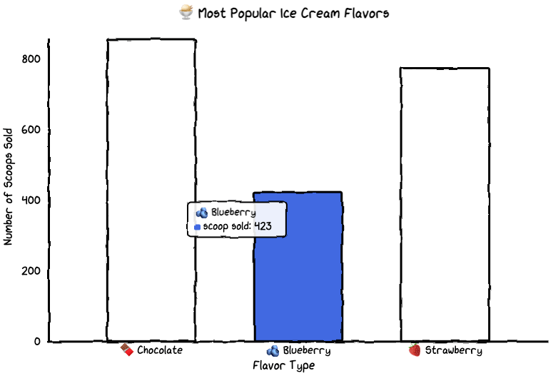
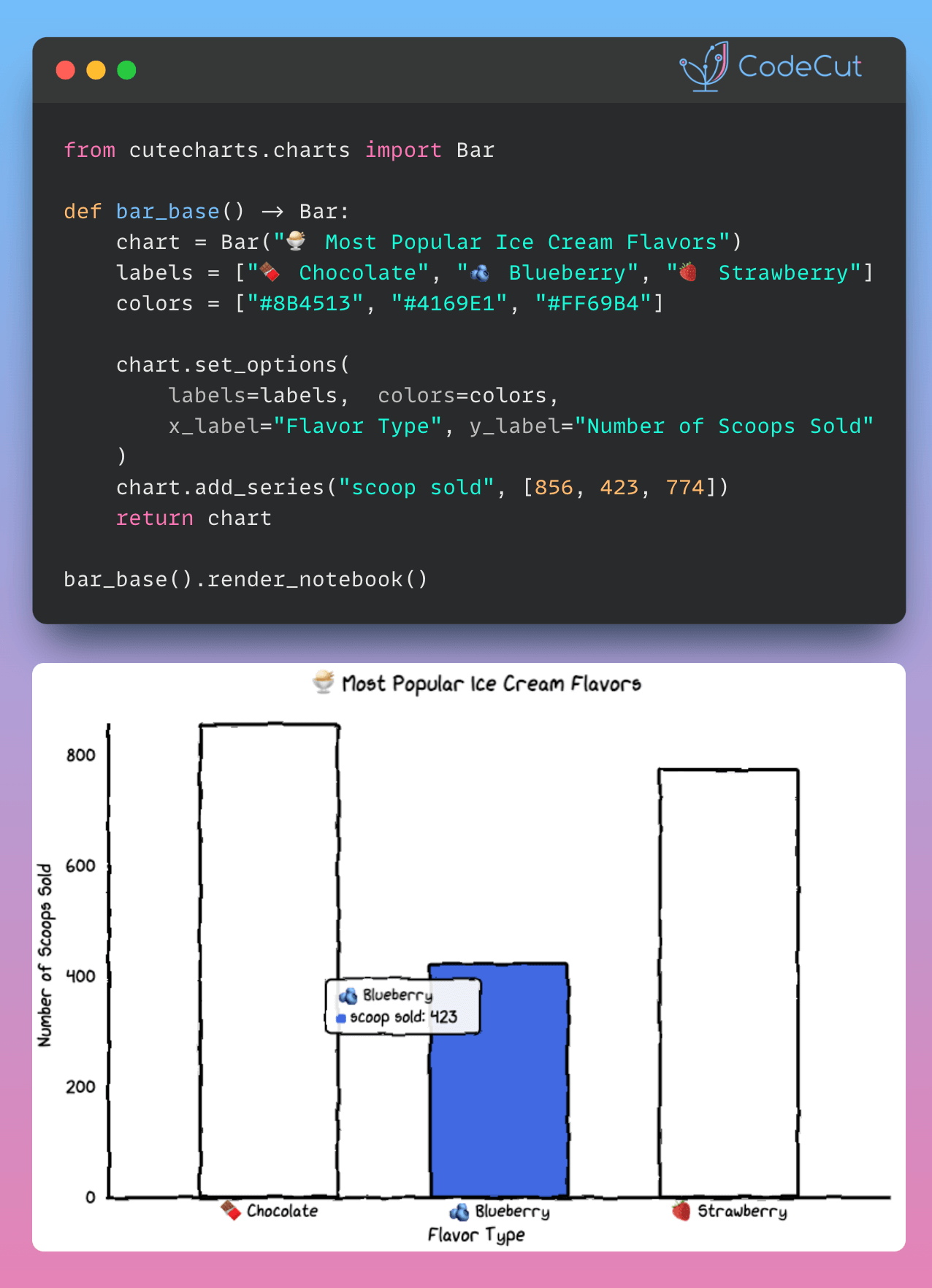
Here an example of creating a cute bar chart:
from cutecharts.charts import Bar


def bar_base() -> Bar:
    chart = Bar("🍨 Most Popular Ice Cream Flavors")
    labels = ["🍫 Chocolate", "🫐 Blueberry", "🍓 Strawberry"]
    colors = ["#8B4513", "#4169E1", "#FF69B4"]

    chart.set_options(
        labels=labels,
        x_label="Flavor Type",
        y_label="Number of Scoops Sold",
        colors=colors,
    )
    chart.add_series("scoop sold", [856, 423, 774])
    return chart


bar_base().render_notebook()