
Table of Contents
- Introduction
- Introduction to Great Tables
- Setup
- Value Formatting
- Table Structure
- Data Coloring
- Nanoplots
- Conditional Styling
- Conclusion
Introduction
Data scientists spend significant time analyzing data, but presenting results professionally remains a challenge.
Raw DataFrames with unformatted numbers, ISO dates, and no visual hierarchy make reports hard to read.
The common workaround is exporting to CSV and formatting in Excel. This is slow, error-prone, and breaks with every data update.
Great Tables solves this problem by letting you create publication-ready tables directly in Python with a single, reproducible script.
💻 Get the Code: The complete source code and Jupyter notebook for this tutorial are available on GitHub. Clone it to follow along!
Stay Current with CodeCut
Actionable Python tips, curated for busy data pros. Skim in under 2 minutes, three times a week.
Introduction to Great Tables
Great Tables is a Python library for creating publication-quality tables from pandas or Polars DataFrames. It provides:
- Value formatting: Transform raw numbers into currencies, percentages, dates, and more
- Table structure: Add headers, column spanners, row labels, and source notes
- Data-driven coloring: Apply color scales based on cell values
- Inline visualizations: Embed sparklines (nanoplots) directly in table cells
- Conditional styling: Style cells based on data conditions
Let’s dive deeper into each of these features in the next sections.
Setup
Great Tables works with both pandas and Polars DataFrames. We’ll use Polars in this tutorial:
pip install great_tables polars selenium
Selenium is required for exporting tables as PNG images.
New to Polars? See our Polars vs. Pandas comparison for an introduction.
Great Tables includes built-in sample datasets. We’ll use the sp500 dataset containing historical S&P 500 stock data:
from great_tables import GT
from great_tables.data import sp500
import polars as pl

# Preview the raw data
sp500_df = pl.from_pandas(sp500)
print(sp500_df.head(5))
| date | open | high | low | close | volume | adj_close |
|---|---|---|---|---|---|---|
| 2015-12-31 | 2060.5901 | 2062.54 | 2043.62 | 2043.9399 | 2.6553e9 | 2043.9399 |
| 2015-12-30 | 2077.3401 | 2077.3401 | 2061.97 | 2063.3601 | 2.3674e9 | 2063.3601 |
| 2015-12-29 | 2060.54 | 2081.5601 | 2060.54 | 2078.3601 | 2.5420e9 | 2078.3601 |
| 2015-12-28 | 2057.77 | 2057.77 | 2044.2 | 2056.5 | 2.4925e9 | 2056.5 |
| 2015-12-24 | 2063.52 | 2067.3601 | 2058.73 | 2060.99 | 1.4119e9 | 2060.99 |
The raw output shows:
- Unformatted decimals (e.g., 2060.5901)
- Large integers without separators (e.g., 2.6553e9)
- Dates as plain strings (e.g., “2015-12-31”)
Let’s transform this into a readable table.
Value Formatting
Great Tables provides fmt_* methods to format values. Here’s how to format currencies, numbers, and dates:
from great_tables import GT
from great_tables.data import sp500

# Filter to a specific date range
start_date = "2010-06-07"
end_date = "2010-06-14"
sp500_mini = sp500[(sp500["date"] >= start_date) & (sp500["date"] <= end_date)]

stock_price_table = (
    GT(sp500_mini)
    .fmt_currency(columns=["open", "high", "low", "close"])
    .fmt_date(columns="date", date_style="wd_m_day_year")
    .fmt_number(columns="volume", compact=True)
    .cols_hide(columns="adj_close")
)
stock_price_table
In this example:
fmt_currency()adds dollar signs and formats decimals (e.g., $1,065.84)fmt_date()converts date strings to readable format (e.g., “Mon, Jun 7, 2010”)fmt_number()withcompact=Trueconverts large numbers to compact format (e.g., 5.47B)cols_hide()removes the redundantadj_closecolumn
To export the table for reports, use the save() method:
stock_price_table.save("stock_price_table.png") # Supports .png, .bmp, .pdf
Formatting Percentages
Use fmt_percent() to display decimal values as percentages. Here’s some sample data with decimal values:
import polars as pl
from great_tables import GT

performance_data = pl.DataFrame({
    "metric": ["Revenue Growth", "Profit Margin", "Market Share"],
    "q1": [0.12, 0.08, 0.23],
    "q2": [0.15, 0.09, 0.25],
    "q3": [0.11, 0.07, 0.24]
})
performance_data
The raw decimals are hard to read at a glance. Let’s format them as percentages:
percent_table = (
    GT(performance_data, rowname_col="metric")
    .fmt_percent(columns=["q1", "q2", "q3"], decimals=1)
)
percent_table
The percentages are now much more readable! Values like 0.12 become “12.0%” automatically.
Table Structure
Professional tables need clear headers, grouped columns, and source attribution. Great Tables provides methods for each structural component.
Adding Headers and Source Notes
Use tab_header() for titles and tab_source_note() for attribution. Let’s start with our S&P 500 data:
from great_tables import GT, md
from great_tables.data import sp500
import polars as pl

sp500_pl = pl.from_pandas(sp500)
sp500_mini = sp500_pl.filter(
    (pl.col("date") >= "2010-06-07") & (pl.col("date") <= "2010-06-14")
)
print(sp500_mini)
| date | open | high | low | close | volume | adj_close |
|---|---|---|---|---|---|---|
| 2010-06-14 | 1095.0 | 1105.91 | 1089.03 | 1089.63 | 4.4258e9 | 1089.63 |
| 2010-06-11 | 1082.65 | 1092.25 | 1077.12 | 1091.6 | 4.0593e9 | 1091.6 |
| 2010-06-10 | 1058.77 | 1087.85 | 1058.77 | 1086.84 | 5.1448e9 | 1086.84 |
| 2010-06-09 | 1062.75 | 1077.74 | 1052.25 | 1055.6899 | 5.9832e9 | 1055.6899 |
| 2010-06-08 | 1050.8101 | 1063.15 | 1042.17 | 1062.0 | 6.1928e9 | 1062.0 |
| 2010-06-07 | 1065.84 | 1071.36 | 1049.86 | 1050.47 | 5.4676e9 | 1050.47 |
The table lacks context about what the data represents. Let’s add a title and source:
header_table = (
    GT(sp500_mini)
    .tab_header(
        title="S&P 500 Daily Performance",
        subtitle="June 7-14, 2010"
    )
    .fmt_currency(columns=["open", "high", "low", "close"])
    .fmt_date(columns="date", date_style="wd_m_day_year")
    .fmt_number(columns="volume", compact=True)
    .cols_hide(columns="adj_close")
    .tab_source_note(source_note=md("**Source**: Historical market data"))
)
header_table
In this example:
tab_header()adds “S&P 500 Daily Performance” as the title and “June 7-14, 2010” as the subtitletab_source_note()adds “Source: Historical market data” at the bottommd()enables markdown formatting for bold text
Grouping Columns with Spanners
Column spanners group related columns under a shared label. Here’s some quarterly sales data:
import polars as pl
from great_tables import GT

sales_data = pl.DataFrame({
    "product": ["Laptop", "Phone", "Tablet"],
    "q1_rev": [125000, 89000, 45000],
    "q2_rev": [132000, 95000, 48000],
    "q1_units": [450, 1200, 380],
    "q2_units": [475, 1350, 410]
})
print(sales_data)
| product | q1_rev | q2_rev | q1_units | q2_units |
|---|---|---|---|---|
| Laptop | 125000 | 132000 | 450 | 475 |
| Phone | 89000 | 95000 | 1200 | 1350 |
| Tablet | 45000 | 48000 | 380 | 410 |
The column names like q1_rev and q1_units don’t clearly show their relationship. Let’s group them with spanners:
spanner_table = (
    GT(sales_data, rowname_col="product")
    .tab_header(title="Quarterly Sales Report")
    .tab_spanner(label="Revenue ($)", columns=["q1_rev", "q2_rev"])
    .tab_spanner(label="Units Sold", columns=["q1_units", "q2_units"])
    .fmt_currency(columns=["q1_rev", "q2_rev"], decimals=0)
    .fmt_number(columns=["q1_units", "q2_units"], use_seps=True)
    .cols_label(
        q1_rev="Q1",
        q2_rev="Q2",
        q1_units="Q1",
        q2_units="Q2"
    )
    .tab_stubhead(label="Product")
)
spanner_table
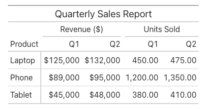
In this example:
tab_spanner()creates “Revenue ($)” and “Units Sold” headers that span multiple columnscols_label()renames columns likeq1_revto “Q1”tab_stubhead()labels the row name column as “Product”
Data Coloring
The data_color() method applies color scales to cells based on their values, creating heatmap-style visualizations. Here’s some regional performance data:
import polars as pl
from great_tables import GT

performance = pl.DataFrame({
    "region": ["North", "South", "East", "West"],
    "revenue": [125000, 98000, 145000, 112000],
    "growth": [0.15, -0.05, 0.22, 0.08]
})
print(performance)
| region | revenue | growth |
|---|---|---|
| North | 125000 | 0.15 |
| South | 98000 | -0.05 |
| East | 145000 | 0.22 |
| West | 112000 | 0.08 |
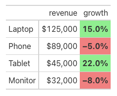
The raw numbers make it hard to spot which regions are performing well. Let’s add color scales:
color_table = (
    GT(performance, rowname_col="region")
    .fmt_currency(columns="revenue", decimals=0)
    .fmt_percent(columns="growth", decimals=1)
    .data_color(
        columns="revenue",
        palette="Blues"
    )
    .data_color(
        columns="growth",
        palette=["red", "white", "green"],
        domain=[-0.1, 0.25]
    )
)
color_table
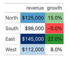
Now high performers stand out immediately! In this example:
palette="Blues"applies a blue gradient to revenue (darker = higher values like $145,000)palette=["red", "white", "green"]creates a diverging scale for growth (red for -5.0%, green for 22.0%)domain=[-0.1, 0.25]sets the min/max range for the color scale
Nanoplots
Nanoplots embed small visualizations directly in table cells. They’re useful for showing trends without creating separate charts.
Creating Line Nanoplots
To use nanoplots, your data column must contain space-separated numeric values:
import polars as pl
from great_tables import GT

# Create data with trend values as space-separated strings
kpi_data = pl.DataFrame({
    "metric": ["Revenue", "Users", "Conversion Rate"],
    "current": [125000.0, 45000.0, 3.2],
    "trend": [
        "95 102 98 115 125",
        "38 40 42 43 45",
        "2.8 2.9 3.0 3.1 3.2"
    ]
})

kpi_table = (
    GT(kpi_data, rowname_col="metric")
    .fmt_nanoplot(columns="trend", plot_type="line")
    .fmt_number(columns="current", compact=True)
    .tab_header(title="Weekly KPI Dashboard")
)
kpi_table

The sparklines make trends instantly visible! fmt_nanoplot() transforms space-separated values like “95 102 98 115 125” into inline charts.
Hover over the chart to see individual data points.
Adding Reference Lines
Reference lines provide context by showing averages, medians, or custom thresholds:
import polars as pl
from great_tables import GT

trend_data = pl.DataFrame({
    "stock": ["AAPL", "GOOGL", "MSFT"],
    "prices": [
        "150 155 148 160 165 158 170",
        "120 118 122 125 128 130 127",
        "280 285 275 290 295 288 300"
    ]
})

stock_trend_table = (
    GT(trend_data, rowname_col="stock")
    .fmt_nanoplot(
        columns="prices",
        plot_type="line",
        reference_line="mean"
    )
    .tab_header(title="Weekly Stock Prices")
)
stock_trend_table
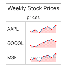
The reference_line="mean" parameter adds a horizontal line at the average value. Other options include "median", "min", "max", "q1", and "q3".
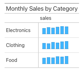
Bar Nanoplots
Use plot_type="bar" for comparing discrete values:
import polars as pl
from great_tables import GT

monthly_data = pl.DataFrame({
    "category": ["Electronics", "Clothing", "Food"],
    "sales": [
        "45 52 48 55 60 58",
        "30 28 35 32 38 40",
        "20 22 21 25 24 26"
    ]
})

bar_chart_table = (
    GT(monthly_data, rowname_col="category")
    .fmt_nanoplot(columns="sales", plot_type="bar")
    .tab_header(title="Monthly Sales by Category")
)
bar_chart_table
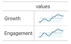
Customizing Nanoplot Appearance
Pass styling options via nanoplot_options():
- Line:
data_line_stroke_color(e.g., “steelblue”) - Points:
data_point_fill_color,data_point_stroke_color - Area:
data_area_fill_color(e.g., “lightblue”)
from great_tables import GT, nanoplot_options
import polars as pl

trend_data = pl.DataFrame({
    "metric": ["Growth", "Engagement"],
    "values": ["10 15 12 18 22 20", "5 8 6 9 11 10"]
})

styled_nanoplot_table = (
    GT(trend_data, rowname_col="metric")
    .fmt_nanoplot(
        columns="values",
        plot_type="line",
        reference_line="mean",
        options=nanoplot_options(
            data_line_stroke_color="steelblue",
            data_point_fill_color="white",
            data_point_stroke_color="steelblue",
            data_area_fill_color="lightblue"
        )
    )
)
styled_nanoplot_table
Conditional Styling
The tab_style() method applies formatting to cells based on conditions. Combined with Polars expressions, you can create data-driven styling rules.
Basic Conditional Styling
Here’s some product sales data with mixed growth values:
from great_tables import GT, style, loc
import polars as pl

sales = pl.DataFrame({
    "product": ["Laptop", "Phone", "Tablet", "Monitor"],
    "revenue": [125000, 89000, 45000, 32000],
    "growth": [0.15, -0.05, 0.22, -0.08]
})
print(sales)
| product | revenue | growth |
|---|---|---|
| Laptop | 125000 | 0.15 |
| Phone | 89000 | -0.05 |
| Tablet | 45000 | 0.22 |
| Monitor | 32000 | -0.08 |
Some products have positive growth, others negative. Let’s use tab_style() with Polars expressions to apply conditional colors:
conditional_table = (
    GT(sales, rowname_col="product")
    .fmt_currency(columns="revenue", decimals=0)
    .fmt_percent(columns="growth", decimals=1)
    .tab_style(
        style=[
            style.fill(color="lightgreen"),
            style.text(weight="bold")
        ],
        locations=loc.body(
            columns="growth",
            rows=pl.col("growth") > 0
        )
    )
    .tab_style(
        style=[
            style.fill(color="lightcoral"),
            style.text(weight="bold")
        ],
        locations=loc.body(
            columns="growth",
            rows=pl.col("growth") < 0
        )
    )
)
conditional_table
The styling makes values immediately visible:
pl.col("growth") > 0– selects rows with positive growthpl.col("growth") < 0– selects rows with negative growth
Conclusion
Great Tables transforms how data scientists present tabular data. Instead of manual formatting in spreadsheets, you can:
- Format currencies, percentages, and dates automatically
- Structure tables with headers, column groups, and source notes
- Highlight patterns with automatic color scales
- Show trends with inline sparkline charts
- Apply conditional styling based on data values
The key advantage is reproducibility. When your data updates, you can re-run the script to regenerate the formatted table with consistent styling.
📚 For comprehensive guidance on building reproducible data workflows, check out Production-Ready Data Science.
Great Tables is particularly useful for:
- Financial reports with currency and percentage formatting
- Performance dashboards with trend indicators
- Research papers requiring publication-quality tables
- Automated reporting pipelines
For more features including custom themes, image embedding, and interactive outputs, see the Great Tables documentation.
Related Tutorials
- Top 6 Python Libraries for Visualization: Compare interactive and static data visualization libraries in Python
- Marimo: A Modern Notebook for Reproducible Data Science: Build reproducible notebook workflows with reactive execution
📚 Want to go deeper? Learning new techniques is the easy part. Knowing how to structure, test, and deploy them is what separates side projects from real work. My book shows you how to build data science projects that actually make it to production. Get the book →
Stay Current with CodeCut
Actionable Python tips, curated for busy data pros. Skim in under 2 minutes, three times a week.


2 thoughts on “Great Tables: Publication-Ready Tables from Polars and Pandas DataFrames”
Using Ubuntu and Python3, Tables do not display to terminal.
The code in this article is designed for notebook/browser rendering. There’s no built-in way to display these styled tables as plain text in a terminal. You might want to use libraries like rich or tabulate to display the tables on the terminal