
Motivation
Scientific visualization is crucial for effectively communicating research findings in academic papers, presentations, and theses. Making publication-ready figures that meet journal requirements can be time-consuming and challenging.
Data scientists and researchers often struggle to format their matplotlib plots to meet the strict requirements of scientific journals, which can involve specific font styles, figure dimensions, and formatting conventions.
Example of basic matplotlib plotting without proper scientific formatting:
import matplotlib.pyplot as plt
import numpy as np

# Generate multiple datasets
x = np.linspace(0, 10, 100)
y1 = np.sin(x)
y2 = np.cos(x)
y3 = np.sin(x) * np.exp(-x/5)

# Basic plotting without proper scientific styling
plt.figure(figsize=(8, 6))
plt.plot(x, y1, label='Sinusoidal')
plt.plot(x, y2, label='Cosine')
plt.plot(x, y3, label='Damped Sine')
plt.xlabel('Time (s)')
plt.ylabel('Amplitude')
plt.legend()
plt.title('Multiple Signals Comparison')
# Need manual tweaking for colors, fonts, sizes, etc.
plt.show()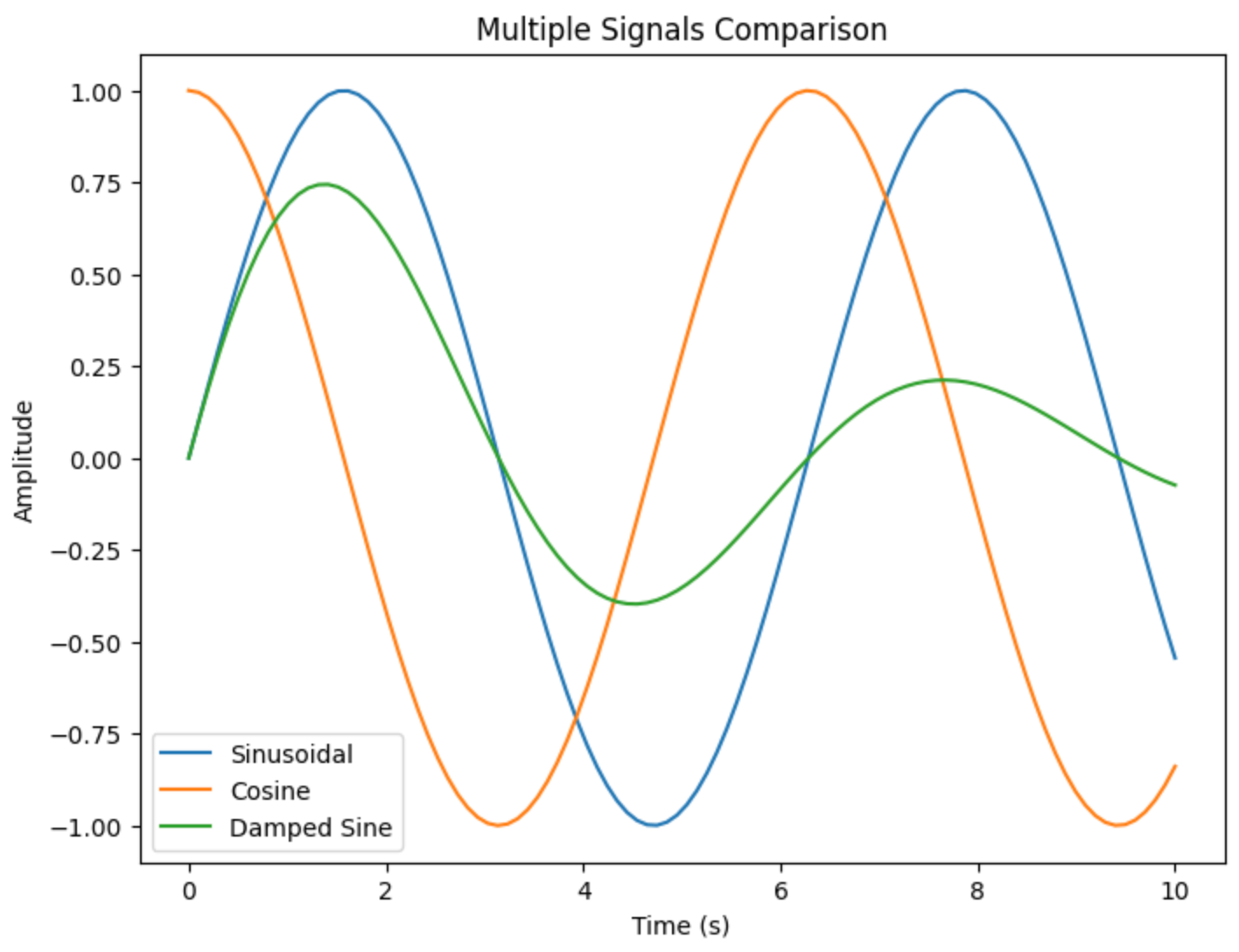
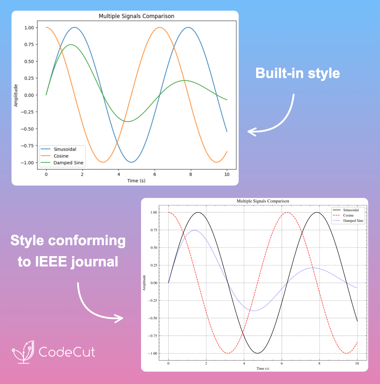
Introduction to SciencePlots
SciencePlots is a Python package that provides professionally designed Matplotlib styles for scientific figures. It offers ready-to-use styles that conform to the requirements of various academic journals, including IEEE and Nature. Installation is straightforward using pip:
pip install SciencePlotsScientific Plotting Styles
SciencePlots solves the formatting challenge by providing pre-configured styles that can be applied with a single line of code. The package includes styles for different journals and use cases.
Let’s create a publication-ready plot:
import scienceplots

# Use the science style
plt.style.use(['science'])

plt.figure(figsize=(8, 6))
plt.plot(x, y1, label='Sinusoidal')
plt.plot(x, y2, label='Cosine')
plt.plot(x, y3, label='Damped Sine')
plt.xlabel('Time (s)')
plt.ylabel('Amplitude')
plt.legend()
plt.title('Multiple Signals Comparison')
plt.show()
For IEEE-style papers:
# Use IEEE style with grid
plt.style.use(['science', 'ieee', 'grid'])

plt.figure(figsize=(8, 6))
plt.plot(x, y1, label='Sinusoidal')
plt.plot(x, y2, label='Cosine')
plt.plot(x, y3, label='Damped Sine')
plt.xlabel('Time (s)')
plt.ylabel('Amplitude')
plt.legend()
plt.title('Multiple Signals Comparison')
plt.show()
Conclusion
SciencePlots streamlines the process of creating publication-ready scientific figures by providing pre-configured styles that meet journal requirements. It saves time and ensures consistency across all figures in scientific publications.