Generic selectors
Exact matches only
Search in title
Search in content
Post Type Selectors
Filter by Categories
About Article
Analyze Data
Archive
Best Practices
Better Outputs
Blog
Code Optimization
Code Quality
Command Line
Daily tips
Dashboard
Data Analysis & Manipulation
Data Engineer
Data Visualization
DataFrame
Delta Lake
DevOps
DuckDB
Environment Management
Feature Engineer
Git
Jupyter Notebook
LLM
LLM
Machine Learning
Machine Learning
Machine Learning & AI
Manage Data
MLOps
Natural Language Processing
NumPy
Pandas
Polars
PySpark
Python Tips
Python Utilities
Python Utilities
Scrape Data
SQL
Testing
Time Series
Tools
Visualization
Visualization & Reporting
Workflow & Automation
Workflow Automation

Visualization

BertViz: Visualize Attention in Transformer Language Models

Understanding how attention mechanisms work in transformer models can be challenging due to the complex interactions between multiple attention heads across different layers.

BertViz is a tool that allows you to interactively visualize and explore attention patterns through multiple views.

Installing BertViz

To use BertViz, you can install it using pip:

!pip install bertviz

Loading a Pre-Trained Model and Tokenizer

First, we load a pre-trained model and tokenizer using the transformers library:

from transformers import AutoTokenizer, AutoModel, utils

utils.logging.set_verbosity_error() # Suppress standard warnings

model_name = "microsoft/xtremedistil-l12-h384-uncased"
input_text = "The cat sat on the mat"

model = AutoModel.from_pretrained(model_name, output_attentions=True)
tokenizer = AutoTokenizer.from_pretrained(model_name)

Tokenizing Input Text and Running the Model

Next, we tokenize the input text and run the model:

inputs = tokenizer.encode(input_text, return_tensors='pt')
outputs = model(inputs)
attention = outputs[-1]
tokens = tokenizer.convert_ids_to_tokens(inputs[0])

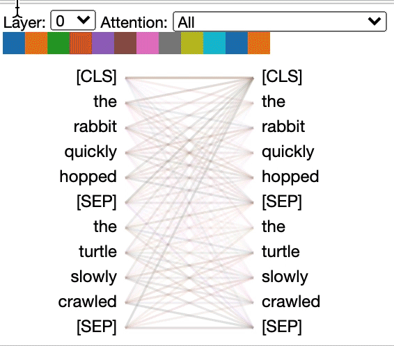
Visualizing Attention with BertViz

We can now use BertViz to visualize the attention patterns in the model. Here, we display the model view:

from bertviz import model_view, head_view

model_view(attention, tokens)

This will display an interactive visualization of the attention patterns in the model.

Displaying Head View

We can also display the head view:

head_view(attention, tokens)

This will display an interactive visualization of the attention patterns in a specific head.

Link to BertViz.
Favorite

BertViz: Visualize Attention in Transformer Language Models Read More »

Leverage Mermaid for Real-Time Git Graph Rendering

The Git graph helps developers visualize and understand the flow of Git operations, making it easier to discuss and share Git branching strategies.

Mermaid enables real-time rendering of the Git graph through commands like merge, checkout, branch, and commit.

Example:

gitGraph
commit
commit
branch feat-1
commit
commit
checkout main
branch feat-2
commit
commit
merge feat-1

In this example, we start by creating two commits on the main branch. We then create a new branch feat-1 and make two commits on it. Next, we switch back to the main branch and create a new branch feat-2, making two commits on it. Finally, we merge the feat-1 branch into main.

The resulting graph shows the flow of these operations, with each branch and commit represented by a node. The merge command creates a new node that combines the changes from both branches.

Learn more about Gitgraph in Mermaid.
Favorite

Leverage Mermaid for Real-Time Git Graph Rendering Read More »

How to Create Beautiful Maps in Python Using Prettymaps Library

If you want to generate stunning maps from OpenStreetMap data in Python, use Prettymaps. In this post, we’ll explore how to use Prettymaps to create beautiful maps with ease.

Getting Started

To get started with Prettymaps, you’ll need to install the library using pip:

pip install -U prettymaps "osmnx>=1.9.3,<2.0" "git+https://github.com/abey79/vsketch@1.0.0"

Basic Usage

Once you have Prettymaps installed, you can start creating maps with just a few lines of code. Plotting with prettymaps is very simple. Run:

prettymaps.plot(your_query)

your_query can be:

An address (Example: “Porto Alegre”),

Latitude / Longitude coordinates (Example: (-30.0324999, -51.2303767))

A custom boundary in GeoDataFrame format

Here’s an example:

import prettymaps

plot = prettymaps.plot('Stad van de Zon, Heerhugowaard, Netherlands')

This will generate a beautiful map of the specified location.

Customizing Your Map

Prettymaps offers a range of options for customizing your map. For example, you can add a circle around the location:

plot = prettymaps.plot('Stad van de Zon, Heerhugowaard, Netherlands', circle=True)

Using Presets

Prettymaps also comes with a range of presets that you can use to customize your map. For example:

plot = prettymaps.plot('Stad van de Zon, Heerhugowaard, Netherlands', preset='minimal')

plot = prettymaps.plot('Stad van de Zon, Heerhugowaard, Netherlands', preset='barcelona')

You can view a list of available presets using the presets() function:

prettymaps.presets()

This will output a table showing the available presets and their parameters.

presetparams0abraca-redencao{‘layers’: {‘perimeter’: {}, ‘streets’: {‘widt…1barcelona{‘layers’: {‘perimeter’: {‘circle’: False}, ‘s…2barcelona-plotter{‘layers’: {‘streets’: {‘width’: {‘primary’: 5…3cb-bf-f{‘layers’: {‘streets’: {‘width’: {‘trunk’: 6, …4default{‘layers’: {‘perimeter’: {}, ‘streets’: {‘widt…5heerhugowaard{‘layers’: {‘perimeter’: {}, ‘streets’: {‘widt…6macao{‘layers’: {‘perimeter’: {}, ‘streets’: {‘cust…7minimal{‘layers’: {‘perimeter’: {}, ‘streets’: {‘widt…8plotter{‘layers’: {‘perimeter’: {}, ‘streets’: {‘widt…9tijuca{‘layers’: {‘perimeter’: {}, ‘streets’: {‘widt…

Conclusion

Prettymaps is a powerful library for creating beautiful maps from OpenStreetMap data in Python. With its easy-to-use interface and range of customization options, it’s the perfect tool for anyone looking to create stunning maps.

Link to prettymaps.
Favorite

How to Create Beautiful Maps in Python Using Prettymaps Library Read More »

ipyvizzy-story: Creating Animated Visualizations in Python

Creating interactive animated data presentations in notebooks often requires complex code with multiple visualization libraries, resulting in non-linear storytelling and difficult-to-follow transitions between different chart states.

import seaborn as sns

df = sns.load_dataset("penguins")
df = df[['species', 'sex']].dropna()
df = df.astype("object")
df["count"] = 1

df.head(10)

speciessexcount0AdelieMale11AdelieFemale12AdelieFemale14AdelieFemale15AdelieMale16AdelieFemale17AdelieMale112AdelieFemale113AdelieMale114AdelieMale1

# Traditional approach: Multiple separate visualizations
import seaborn as sns
import matplotlib.pyplot as plt

# First view – grouped bar chart
plt.figure(1)
sns.barplot(data=df, x='sex', y='count')
plt.show()

# Second view – separate plot for stacked bars
plt.figure(2)
sns.barplot(data=df, x='count', y='species', hue='sex')
plt.show()

# No smooth transitions between views
# Manual navigation between plots

ipyvizzu-story enables creation of fluid data stories with smooth transitions between insights:

from ipyvizzu import Data, Config
from ipyvizzustory import Story, Slide, Step

data = Data()
data.add_df(df)

story = Story(data=data)

slide1 = Slide(
Step(
Config({"x": ["count", "sex"], "label": ["count", "sex"], "color": "sex"})
)
)
story.add_slide(slide1)

slide2 = Slide(
Step(
Config({"x": "count", "y": ["species", "sex"]})
)
)
story.add_slide(slide2)

story.play()

The example shows how ipyvizzu-story simplifies creating interactive presentations by handling transitions automatically. You define different views as slides, and the library creates smooth animations between them, including keyboard navigation controls.

Link to ipyvizzu-store.
Favorite

ipyvizzy-story: Creating Animated Visualizations in Python Read More »

Creating Venn Diagrams with Python using Matplotlib-Venn

Venn diagrams are a great way to visualize the relationships between sets, and with Python, you can easily create them using the matplotlib-venn library. In this post, we’ll explore how to create Venn diagrams using matplotlib-venn and provide some examples to get you started.

Installing Matplotlib-Venn

Before you can start creating Venn diagrams, you’ll need to install the matplotlib-venn library. You can do this using pip:

pip install matplotlib-venn

Creating a Venn Diagram with Two Circles

To create a Venn diagram with two circles, you can use the venn2 function from matplotlib-venn. This function takes two main arguments: subsets and set_labels. The subsets argument specifies the size of each region in the Venn diagram, while the set_labels argument specifies the labels for each set.

Here’s an example of how to create a Venn diagram with two circles:

import matplotlib.pyplot as plt
from matplotlib_venn import venn2

venn2(subsets = (8, 10, 5), set_labels = ('Are Healthy', 'Do Exercise'))
plt.show()

This code will create a Venn diagram with two circles, where the first circle represents people who are healthy, the second circle represents people who do exercise, and the overlap between the two circles represents people who are both healthy and do exercise.

Specifying Elements in Each Set

Instead of specifying the size of each region, you can also specify the elements in each set using the venn2 function. Here’s an example:

venn2([set(['A', 'B', 'C', 'D']), set(['D', 'E', 'F'])], set_labels=['Group1', 'Group2'])
plt.show()

This code creates a Venn diagram with two circles, where the first circle represents Group1 and the second circle represents Group2. The elements in each set are specified using the set function.

Creating a Venn Diagram with Three Circles

To create a Venn diagram with three circles, you can use the venn3 function from matplotlib-venn. This function takes three main arguments: subsets, set_labels, and colors. The subsets argument specifies the size of each region in the Venn diagram, while the set_labels argument specifies the labels for each set.

Here’s an example of how to create a Venn diagram with three circles:

from matplotlib_venn import venn3
venn3(subsets = (5, 5, 3, 5, 3, 3, 2), set_labels = ('Are Healthy', 'Do Exercise', 'Eat Well'))
plt.show()

This code creates a Venn diagram with three circles, where the first circle represents people who are healthy, the second circle represents people who do exercise, and the third circle represents people who eat well.

Link to matplotlib-venn.
Favorite

Creating Venn Diagrams with Python using Matplotlib-Venn Read More »

Cute Charts: Python Visualization Made Memorable

If you want to make graphs for a technical presentation more interesting and memorable, use cute charts, a Python visualization library.

Here an example of creating a cute bar chart:

from cutecharts.charts import Bar

def bar_base() -> Bar:
chart = Bar("🍨 Most Popular Ice Cream Flavors")
labels = ["🍫 Chocolate", "🫐 Blueberry", "🍓 Strawberry"]
colors = ["#8B4513", "#4169E1", "#FF69B4"]

chart.set_options(
labels=labels,
x_label="Flavor Type",
y_label="Number of Scoops Sold",
colors=colors,
)
chart.add_series("scoop sold", [856, 423, 774])
return chart

bar_base().render_notebook()

Link to cute charts.

Favorite

Cute Charts: Python Visualization Made Memorable Read More »

TimberTrek: Create an Interactive and Comprehensive Decision Tree

Complex decision tree ensembles like random forests and gradient-boosted trees can be hard to understand and interpret. This results in difficulties for data scientists in making informed decisions about model refinement or deployment.

TimberTrek helps address this issue by providing an interactive visualization tool for exploring and comparing multiple decision tree models.

It also lets users filter and select models based on custom criteria (e.g., fairness, simplicity).

Link to TimberTrek.
Favorite

TimberTrek: Create an Interactive and Comprehensive Decision Tree Read More »

hvPlot: One Syntax for Bokeh, Matplotlib, and Plotly

Switching between plotting libraries lets you leverage their unique strengths. However, learning multiple specific APIs can significantly increase your cognitive load.

hvPlot provides a unified, high-level API that allows using the same syntax for Bokeh, Matplotlib, and Plotly. Here’s an example of how hvPlot can be used with different backends:

import hvplot.pandas
from bokeh.sampledata.penguins import data as df

# Default (Bokeh)
df.hvplot.scatter(x='bill_length_mm', y='bill_depth_mm', by='species')

# Matplotlib
hvplot.extension('matplotlib')
df.hvplot.scatter(x='bill_length_mm', y='bill_depth_mm', by='species')

# Plotly
hvplot.extension('plotly')
df.hvplot.scatter(x='bill_length_mm', y='bill_depth_mm', by='species')

This allows data scientists to create visualizations using a familiar API while leveraging the strengths of different plotting libraries.

Link to hvPlot.
Favorite

hvPlot: One Syntax for Bokeh, Matplotlib, and Plotly Read More »

Drag-and-Drop Visualizations with PyGWalker

EDA is a crucial step in any Data Science project. For large datasets, EDA can be time-consuming.

PyGWalker simplifies the process of creating visualizations by allowing users to drag and drop variables to create charts without writing much code.

You can use PyGWalker without changing your existing workflow. For example, you can call up PyGWalker with the Dataframe loaded in this way:

import pygwalker as pyg
import pandas as pd

df = pd.read_csv("https://kanaries-app.s3.ap-northeast-1.amazonaws.com/public-datasets/bike_sharing_dc.csv", parse_dates=['date'])
df.head(10)

Output:

date month season hour year holiday temperature feeling_temp \
0 2011-01-01 1 winter 0 2011 no 3.28 3.0014
1 2011-01-01 1 winter 1 2011 no 2.34 1.9982
2 2011-01-01 1 winter 2 2011 no 2.34 1.9982
3 2011-01-01 1 winter 3 2011 no 3.28 3.0014
4 2011-01-01 1 winter 4 2011 no 3.28 3.0014

humidity winspeed casual registered count work yes or not am or pm \
0 81.0 0.0 3 13 16 0 am
1 80.0 0.0 8 32 40 0 am
2 80.0 0.0 5 27 32 0 am
3 75.0 0.0 3 10 13 0 am
4 75.0 0.0 0 1 1 0 am

Day of the week
0 6
1 6
2 6
3 6
4 6

And then just walk around!

Link to PygWalker.

Run in Google Colab.
Favorite

Drag-and-Drop Visualizations with PyGWalker Read More »

0
    0
    Your Cart
    Your cart is empty
    Scroll to Top

    Work with Khuyen Tran

    Work with Khuyen Tran