Generic selectors
Exact matches only
Search in title
Search in content
Post Type Selectors
Filter by Categories
About Article
Analyze Data
Archive
Best Practices
Better Outputs
Blog
Code Optimization
Code Quality
Command Line
Daily tips
Dashboard
Data Analysis & Manipulation
Data Engineer
Data Visualization
DataFrame
Delta Lake
DevOps
DuckDB
Environment Management
Feature Engineer
Git
Jupyter Notebook
LLM
LLM Tools
Machine Learning
Machine Learning & AI
Machine Learning Tools
Manage Data
MLOps
Natural Language Processing
Newsletter Archive
NumPy
Pandas
Polars
PySpark
Python Helpers
Python Tips
Python Utilities
Scrape Data
SQL
Testing
Time Series
Tools
Visualization
Visualization & Reporting
Workflow & Automation
Workflow Automation

Visualization

Manim: Create Mathematical Animations Like 3Blue1Brown Using Python

Table of Contents

Motivation
What is Manim?
Create a Blue Square that Grows from the Center
Turn a Square into a Circle
Customize Manim
Write Mathematical Equations with a Moving Frame
Moving and Zooming Camera
Graph
Move Objects Together
Trace Path
Recap

Motivation
Have you ever struggled with math concepts in a machine learning algorithm and turned to 3Blue1Brown as a learning resource? 3Blue1Brown is a popular math YouTube channel created by Grant Sanderson, known for exceptional explanations and stunning animations.
What if you could create similar animations to explain data science concepts to your teammates, managers, or followers?
Grant developed a Python package called Manim that enables you to create mathematical animations or pictures using Python. In this article, you will learn how to create beautiful mathematical animations using Manim.

💻 Get the Code: The complete source code and Jupyter notebook for this tutorial are available on GitHub. Clone it to follow along!

What is Manim?
Manim is an animation engine for creating precise, explanatory math videos. Note that there are two versions of Manim:

The original version created by Grant Sanderson
The community-maintained version

Since the Manim Community version is updated more frequently and better tested, we’ll use it for this tutorial.
To install the dependencies for the package, visit the Documentation. After the dependencies are installed, run:
pip install manim

Create a Blue Square that Grows from the Center
We’ll start by creating a blue square that grows from the center:
from manim import *

class GrowingSquare(Scene):
def construct(self):
square = Square(color=BLUE, fill_opacity=0.5)
self.play(GrowFromCenter(square))
self.wait()

The code leverages four key Manim elements to produce the animation.

Scene: Base class providing animation infrastructure via construct() and play() methods
Square(color, fill_opacity): Mobject for creating squares with specified stroke color and fill transparency
GrowFromCenter: Growth animation starting from the object’s center
wait(): 1-second pause in animation timeline

Save the script above as start.py. Now run the command below to generate a video for the script:
manim -p -ql start.py GrowingSquare

A video called GrowingSquare.mp4 will be saved in your local directory. You should see a blue square growing from the center.

Explanation of the options:

-p: play the video once it finishes generating
-ql: generate a video with low quality

To generate a video with high quality, use -qh instead.
To create a GIF instead of a video, add –format=gif to the command:
manim -p -ql –format=gif start.py GrowingSquare

Turn a Square into a Circle
Creating a square alone is not that exciting. Let’s transform the square into a circle using the Transform animation.
from manim import *

class SquareToCircle(Scene):
def construct(self):
circle = Circle()
circle.set_fill(PINK, opacity=0.5)

square = Square()
square.rotate(PI / 4)

self.play(Create(square))
self.play(Transform(square, circle))
self.play(FadeOut(square))

This code demonstrates creating shapes, styling them, and applying different animation effects.

Circle: Creates a circular shape
set_fill(color, opacity): Sets the fill color and transparency (0.5 = 50% transparent)
rotate(angle): Rotates the object by an angle (PI/4 = 45 degrees)
Create: Animation that draws the shape onto the screen
Transform: Smoothly morphs one shape into another
FadeOut: Makes the object gradually disappear

Find a comprehensive list of shapes in the Manim geometry documentation.
Customize Manim
If you don’t want the background to be black, you can change it to white using self.camera.background_color:
from manim import *

class CustomBackground(Scene):
def construct(self):
self.camera.background_color = WHITE

square = Square(color=BLUE, fill_opacity=0.5)
circle = Circle(color=RED, fill_opacity=0.5)

self.play(Create(square))
self.wait()
self.play(Transform(square, circle))
self.wait()

Find other ways to customize Manim in the configuration documentation.
Write Mathematical Equations with a Moving Frame
You can create animations that write mathematical equations using the MathTex class:
from manim import *

class WriteEquation(Scene):
def construct(self):
equation = MathTex(r"e^{i\pi} + 1 = 0")

self.play(Write(equation))
self.wait()

This code demonstrates writing mathematical equations using LaTeX.

MathTex: Creates mathematical equations using LaTeX notation (the r prefix indicates a raw string for LaTeX commands)
Write: Animation that makes text appear as if being written by hand

Or show step-by-step solutions to equations:
from manim import *

class EquationSteps(Scene):
def construct(self):
step1 = MathTex(r"2x + 5 = 13")
step2 = MathTex(r"2x = 8")
step3 = MathTex(r"x = 4")

self.play(Write(step1))
self.wait()
self.play(Transform(step1, step2))
self.wait()
self.play(Transform(step1, step3))
self.wait()

Let’s break down this code:

Three equation stages: Separate MathTex objects for each step of the solution
Progressive transformation: Transform morphs the first equation through intermediate and final stages
Timed pauses: wait() creates natural breaks between steps for a teaching pace

You can also highlight specific parts of equations using frames:
from manim import *

class MovingFrame(Scene):
def construct(self):
# Write equations
equation = MathTex("2x^2-5x+2", "=", "(x-2)(2x-1)")

# Create animation
self.play(Write(equation))

# Add moving frames
framebox1 = SurroundingRectangle(equation[0], buff=.1)
framebox2 = SurroundingRectangle(equation[2], buff=.1)

# Create animations
self.play(Create(framebox1))

self.wait()
# Replace frame 1 with frame 2
self.play(ReplacementTransform(framebox1, framebox2))

self.wait()

In this code, we use the following elements:

MathTex with multiple arguments: Breaks the equation into separate parts that can be individually accessed and highlighted
SurroundingRectangle(mobject, buff): Creates a box around an equation part (buff=0.1 sets the space between the box and the content)
ReplacementTransform: Smoothly moves and morphs one frame into another, replacing the first frame with the second

Moving and Zooming Camera
You can adjust the camera and select which part of the equations to zoom in using a class inherited from MovingCameraScene:
from manim import *

class MovingCamera(MovingCameraScene):
def construct(self):
equation = MathTex(
r"\frac{d}{dx}(x^2) = 2x"
)

self.play(Write(equation))
self.wait()

# Zoom in on the derivative
self.play(
self.camera.frame.animate.scale(0.5).move_to(equation[0])
)
self.wait()

This code shows how to zoom in on specific parts of your animation.

MovingCameraScene: A special scene type that allows the camera to move and zoom
self.camera.frame: Represents the camera’s view that you can move and zoom
animate.scale(0.5): Zooms in by making the camera view 50% smaller (objects appear twice as big)
move_to(equation[0]): Centers the camera on the first part of the equation
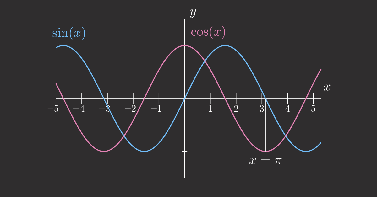
Graph
You can use Manim to create annotated graphs:
from manim import *

class Graph(Scene):
def construct(self):
axes = Axes(
x_range=[-3, 3, 1],
y_range=[-5, 5, 1],
x_length=6,
y_length=6,
)

# Add labels
axes_labels = axes.get_axis_labels(x_label="x", y_label="f(x)")

# Create a function graph
graph = axes.plot(lambda x: x**2, color=BLUE)
graph_label = axes.get_graph_label(graph, label="x^2")

self.add(axes, axes_labels)
self.play(Create(graph))
self.play(Write(graph_label))
self.wait()

This code shows how to create mathematical function graphs with labeled axes.

Axes: Creates a coordinate grid with specified ranges (e.g., x from -3 to 3, y from -5 to 5) and sizes
get_axis_labels: Adds “x” and “f(x)” labels to the coordinate axes
plot(lambda x: x2)**: Plots a mathematical function (here, x squared) as a curve on the axes
get_graph_label: Adds a label showing the function’s equation next to the plotted curve
self.add: Instantly displays objects on screen without animating them in

If you want to get an image of the last frame of a scene, add -s to the command:
manim -p -qh -s more.py Graph

You can also animate the process of setting up the axes:
manim -p -qh more.py Graph

Move Objects Together
You can use VGroup to group different Manim objects and move them together:
from manim import *

class MoveObjectsTogether(Scene):
def construct(self):
square = Square(color=BLUE)
circle = Circle(color=RED)

# Group objects
group = VGroup(square, circle)
group.arrange(RIGHT, buff=1)

self.play(Create(group))
self.wait()

# Move the entire group
self.play(group.animate.shift(UP * 2))
self.wait()

This code shows how to group objects and move them together as one unit.

VGroup: Groups multiple objects together so you can control them all at once (like selecting multiple items)
arrange(RIGHT, buff=1): Lines up the objects horizontally from left to right with 1 unit of space between them
shift(UP * 2): Moves the entire group upward by 2 units (multiplying by 2 makes it move twice as far)

You can also create multiple groups and manipulate them independently or together:
from manim import *

class GroupCircles(Scene):
def construct(self):
# Create circles
circle_green = Circle(color=GREEN)
circle_blue = Circle(color=BLUE)
circle_red = Circle(color=RED)

# Set initial positions
circle_green.shift(LEFT)
circle_blue.shift(RIGHT)

# Create 2 different groups
gr = VGroup(circle_green, circle_red)
gr2 = VGroup(circle_blue)
self.add(gr, gr2)
self.wait()

# Shift 2 groups down
self.play((gr + gr2).animate.shift(DOWN))

# Move only 1 group
self.play(gr.animate.shift(RIGHT))
self.play(gr.animate.shift(UP))

# Shift 2 groups to the right
self.play((gr + gr2).animate.shift(RIGHT))
self.play(circle_red.animate.shift(RIGHT))
self.wait()

Trace Path
You can use TracedPath to create a trace of a moving object:
from manim import *

class TracePath(Scene):
def construct(self):
dot = Dot(color=RED)

# Create traced path
path = TracedPath(dot.get_center, stroke_color=BLUE, stroke_width=4)
self.add(path, dot)

# Move the dot in a circular pattern
self.play(
MoveAlongPath(dot, Circle(radius=2)),
rate_func=linear,
run_time=4
)
self.wait()

This code shows how to create a trail that follows a moving object.

Dot: A small circular point that you can move around
TracedPath(dot.get_center): Creates a line that draws itself following the dot’s path (like a pen trail)
get_center: Gets the current position of the dot so TracedPath knows where to draw
MoveAlongPath(dot, Circle(radius=2)): Moves the dot along a circular path with radius 2
rate_func=linear: Makes the dot move at a constant speed (no speeding up or slowing down)
run_time=4: The animation takes 4 seconds to complete

For a more complex example, you can create a rolling circle that traces a cycloid pattern:
from manim import *

class RollingCircleTrace(Scene):
def construct(self):
# Create circle and dot
circ = Circle(color=BLUE).shift(4*LEFT)
dot = Dot(color=BLUE).move_to(circ.get_start())

# Group dot and circle
rolling_circle = VGroup(circ, dot)
trace = TracedPath(circ.get_start)

# Rotate the circle
rolling_circle.add_updater(lambda m: m.rotate(-0.3))

# Add trace and rolling circle to the scene
self.add(trace, rolling_circle)

# Shift the circle to 8*RIGHT
self.play(rolling_circle.animate.shift(8*RIGHT), run_time=4, rate_func=linear)

This code creates a rolling wheel animation that draws a curved pattern as it moves.

Setup: Creates a blue circle at the left side and places a blue dot at the circle’s edge
Grouping: Uses VGroup to combine the circle and dot so they move together
Path tracking: TracedPath watches the circle’s starting point and draws a line following it
Continuous rotation: add_updater makes the circle rotate automatically every frame, creating the rolling effect
Rolling motion: As the group shifts right, the rotation updater makes it look like a wheel rolling across the screen
Cycloid pattern: The traced path creates a wave-like curve showing the mathematical path a point on a rolling wheel makes

Recap
Congratulations! You have just learned how to use Manim and what it can do. To recap, there are three kinds of objects that Manim provides:

Mobjects: Objects that can be displayed on the screen, such as Circle, Square, Matrix, Angle, etc.
Scenes: Canvas for animations such as Scene, MovingCameraScene, etc.
Animations: Animations applied to Mobjects such as Write, Create, GrowFromCenter, Transform, etc.

There is so much more Manim can do that I cannot cover here. The best way to learn is through practice, so I encourage you to try the examples in this article and check out Manim’s tutorial.
Favorite

Manim: Create Mathematical Animations Like 3Blue1Brown Using Python Read More »

BertViz: Visualize Attention in Transformer Language Models

Understanding how attention mechanisms work in transformer models can be challenging due to the complex interactions between multiple attention heads across different layers.

BertViz is a tool that allows you to interactively visualize and explore attention patterns through multiple views.

Installing BertViz

To use BertViz, you can install it using pip:

!pip install bertviz

Loading a Pre-Trained Model and Tokenizer

First, we load a pre-trained model and tokenizer using the transformers library:

from transformers import AutoTokenizer, AutoModel, utils

utils.logging.set_verbosity_error() # Suppress standard warnings

model_name = "microsoft/xtremedistil-l12-h384-uncased"
input_text = "The cat sat on the mat"

model = AutoModel.from_pretrained(model_name, output_attentions=True)
tokenizer = AutoTokenizer.from_pretrained(model_name)

Tokenizing Input Text and Running the Model

Next, we tokenize the input text and run the model:

inputs = tokenizer.encode(input_text, return_tensors='pt')
outputs = model(inputs)
attention = outputs[-1]
tokens = tokenizer.convert_ids_to_tokens(inputs[0])

Visualizing Attention with BertViz

We can now use BertViz to visualize the attention patterns in the model. Here, we display the model view:

from bertviz import model_view, head_view

model_view(attention, tokens)

This will display an interactive visualization of the attention patterns in the model.

Displaying Head View

We can also display the head view:

head_view(attention, tokens)

This will display an interactive visualization of the attention patterns in a specific head.

Link to BertViz.
Favorite

BertViz: Visualize Attention in Transformer Language Models Read More »

Leverage Mermaid for Real-Time Git Graph Rendering

The Git graph helps developers visualize and understand the flow of Git operations, making it easier to discuss and share Git branching strategies.

Mermaid enables real-time rendering of the Git graph through commands like merge, checkout, branch, and commit.

Example:

gitGraph
commit
commit
branch feat-1
commit
commit
checkout main
branch feat-2
commit
commit
merge feat-1

In this example, we start by creating two commits on the main branch. We then create a new branch feat-1 and make two commits on it. Next, we switch back to the main branch and create a new branch feat-2, making two commits on it. Finally, we merge the feat-1 branch into main.

The resulting graph shows the flow of these operations, with each branch and commit represented by a node. The merge command creates a new node that combines the changes from both branches.

Learn more about Gitgraph in Mermaid.
Favorite

Leverage Mermaid for Real-Time Git Graph Rendering Read More »

How to Create Beautiful Maps in Python Using Prettymaps Library

If you want to generate stunning maps from OpenStreetMap data in Python, use Prettymaps. In this post, we’ll explore how to use Prettymaps to create beautiful maps with ease.

Getting Started

To get started with Prettymaps, you’ll need to install the library using pip:

pip install -U prettymaps "osmnx>=1.9.3,<2.0" "git+https://github.com/abey79/vsketch@1.0.0"

Basic Usage

Once you have Prettymaps installed, you can start creating maps with just a few lines of code. Plotting with prettymaps is very simple. Run:

prettymaps.plot(your_query)

your_query can be:

An address (Example: “Porto Alegre”),

Latitude / Longitude coordinates (Example: (-30.0324999, -51.2303767))

A custom boundary in GeoDataFrame format

Here’s an example:

import prettymaps

plot = prettymaps.plot('Stad van de Zon, Heerhugowaard, Netherlands')

This will generate a beautiful map of the specified location.

Customizing Your Map

Prettymaps offers a range of options for customizing your map. For example, you can add a circle around the location:

plot = prettymaps.plot('Stad van de Zon, Heerhugowaard, Netherlands', circle=True)

Using Presets

Prettymaps also comes with a range of presets that you can use to customize your map. For example:

plot = prettymaps.plot('Stad van de Zon, Heerhugowaard, Netherlands', preset='minimal')

plot = prettymaps.plot('Stad van de Zon, Heerhugowaard, Netherlands', preset='barcelona')

You can view a list of available presets using the presets() function:

prettymaps.presets()

This will output a table showing the available presets and their parameters.

presetparams0abraca-redencao{‘layers’: {‘perimeter’: {}, ‘streets’: {‘widt…1barcelona{‘layers’: {‘perimeter’: {‘circle’: False}, ‘s…2barcelona-plotter{‘layers’: {‘streets’: {‘width’: {‘primary’: 5…3cb-bf-f{‘layers’: {‘streets’: {‘width’: {‘trunk’: 6, …4default{‘layers’: {‘perimeter’: {}, ‘streets’: {‘widt…5heerhugowaard{‘layers’: {‘perimeter’: {}, ‘streets’: {‘widt…6macao{‘layers’: {‘perimeter’: {}, ‘streets’: {‘cust…7minimal{‘layers’: {‘perimeter’: {}, ‘streets’: {‘widt…8plotter{‘layers’: {‘perimeter’: {}, ‘streets’: {‘widt…9tijuca{‘layers’: {‘perimeter’: {}, ‘streets’: {‘widt…

Conclusion

Prettymaps is a powerful library for creating beautiful maps from OpenStreetMap data in Python. With its easy-to-use interface and range of customization options, it’s the perfect tool for anyone looking to create stunning maps.

Link to prettymaps.
Favorite

How to Create Beautiful Maps in Python Using Prettymaps Library Read More »

ipyvizzy-story: Creating Animated Visualizations in Python

Creating interactive animated data presentations in notebooks often requires complex code with multiple visualization libraries, resulting in non-linear storytelling and difficult-to-follow transitions between different chart states.

import seaborn as sns

df = sns.load_dataset("penguins")
df = df[['species', 'sex']].dropna()
df = df.astype("object")
df["count"] = 1

df.head(10)

speciessexcount0AdelieMale11AdelieFemale12AdelieFemale14AdelieFemale15AdelieMale16AdelieFemale17AdelieMale112AdelieFemale113AdelieMale114AdelieMale1

# Traditional approach: Multiple separate visualizations
import seaborn as sns
import matplotlib.pyplot as plt

# First view – grouped bar chart
plt.figure(1)
sns.barplot(data=df, x='sex', y='count')
plt.show()

# Second view – separate plot for stacked bars
plt.figure(2)
sns.barplot(data=df, x='count', y='species', hue='sex')
plt.show()

# No smooth transitions between views
# Manual navigation between plots

ipyvizzu-story enables creation of fluid data stories with smooth transitions between insights:

from ipyvizzu import Data, Config
from ipyvizzustory import Story, Slide, Step

data = Data()
data.add_df(df)

story = Story(data=data)

slide1 = Slide(
Step(
Config({"x": ["count", "sex"], "label": ["count", "sex"], "color": "sex"})
)
)
story.add_slide(slide1)

slide2 = Slide(
Step(
Config({"x": "count", "y": ["species", "sex"]})
)
)
story.add_slide(slide2)

story.play()

The example shows how ipyvizzu-story simplifies creating interactive presentations by handling transitions automatically. You define different views as slides, and the library creates smooth animations between them, including keyboard navigation controls.

Link to ipyvizzu-store.
Favorite

ipyvizzy-story: Creating Animated Visualizations in Python Read More »

Creating Venn Diagrams with Python using Matplotlib-Venn

Venn diagrams are a great way to visualize the relationships between sets, and with Python, you can easily create them using the matplotlib-venn library. In this post, we’ll explore how to create Venn diagrams using matplotlib-venn and provide some examples to get you started.

Installing Matplotlib-Venn

Before you can start creating Venn diagrams, you’ll need to install the matplotlib-venn library. You can do this using pip:

pip install matplotlib-venn

Creating a Venn Diagram with Two Circles

To create a Venn diagram with two circles, you can use the venn2 function from matplotlib-venn. This function takes two main arguments: subsets and set_labels. The subsets argument specifies the size of each region in the Venn diagram, while the set_labels argument specifies the labels for each set.

Here’s an example of how to create a Venn diagram with two circles:

import matplotlib.pyplot as plt
from matplotlib_venn import venn2

venn2(subsets = (8, 10, 5), set_labels = ('Are Healthy', 'Do Exercise'))
plt.show()

This code will create a Venn diagram with two circles, where the first circle represents people who are healthy, the second circle represents people who do exercise, and the overlap between the two circles represents people who are both healthy and do exercise.

Specifying Elements in Each Set

Instead of specifying the size of each region, you can also specify the elements in each set using the venn2 function. Here’s an example:

venn2([set(['A', 'B', 'C', 'D']), set(['D', 'E', 'F'])], set_labels=['Group1', 'Group2'])
plt.show()

This code creates a Venn diagram with two circles, where the first circle represents Group1 and the second circle represents Group2. The elements in each set are specified using the set function.

Creating a Venn Diagram with Three Circles

To create a Venn diagram with three circles, you can use the venn3 function from matplotlib-venn. This function takes three main arguments: subsets, set_labels, and colors. The subsets argument specifies the size of each region in the Venn diagram, while the set_labels argument specifies the labels for each set.

Here’s an example of how to create a Venn diagram with three circles:

from matplotlib_venn import venn3
venn3(subsets = (5, 5, 3, 5, 3, 3, 2), set_labels = ('Are Healthy', 'Do Exercise', 'Eat Well'))
plt.show()

This code creates a Venn diagram with three circles, where the first circle represents people who are healthy, the second circle represents people who do exercise, and the third circle represents people who eat well.

Link to matplotlib-venn.
Favorite

Creating Venn Diagrams with Python using Matplotlib-Venn Read More »

Cute Charts: Python Visualization Made Memorable

If you want to make graphs for a technical presentation more interesting and memorable, use cute charts, a Python visualization library.

Here an example of creating a cute bar chart:

from cutecharts.charts import Bar

def bar_base() -> Bar:
chart = Bar("🍨 Most Popular Ice Cream Flavors")
labels = ["🍫 Chocolate", "🫐 Blueberry", "🍓 Strawberry"]
colors = ["#8B4513", "#4169E1", "#FF69B4"]

chart.set_options(
labels=labels,
x_label="Flavor Type",
y_label="Number of Scoops Sold",
colors=colors,
)
chart.add_series("scoop sold", [856, 423, 774])
return chart

bar_base().render_notebook()

Link to cute charts.

Favorite

Cute Charts: Python Visualization Made Memorable Read More »

TimberTrek: Create an Interactive and Comprehensive Decision Tree

Complex decision tree ensembles like random forests and gradient-boosted trees can be hard to understand and interpret. This results in difficulties for data scientists in making informed decisions about model refinement or deployment.

TimberTrek helps address this issue by providing an interactive visualization tool for exploring and comparing multiple decision tree models.

It also lets users filter and select models based on custom criteria (e.g., fairness, simplicity).

Link to TimberTrek.
Favorite

TimberTrek: Create an Interactive and Comprehensive Decision Tree Read More »

hvPlot: One Syntax for Bokeh, Matplotlib, and Plotly

Switching between plotting libraries lets you leverage their unique strengths. However, learning multiple specific APIs can significantly increase your cognitive load.

hvPlot provides a unified, high-level API that allows using the same syntax for Bokeh, Matplotlib, and Plotly. Here’s an example of how hvPlot can be used with different backends:

import hvplot.pandas
from bokeh.sampledata.penguins import data as df

# Default (Bokeh)
df.hvplot.scatter(x='bill_length_mm', y='bill_depth_mm', by='species')

# Matplotlib
hvplot.extension('matplotlib')
df.hvplot.scatter(x='bill_length_mm', y='bill_depth_mm', by='species')

# Plotly
hvplot.extension('plotly')
df.hvplot.scatter(x='bill_length_mm', y='bill_depth_mm', by='species')

This allows data scientists to create visualizations using a familiar API while leveraging the strengths of different plotting libraries.

Link to hvPlot.
Favorite

hvPlot: One Syntax for Bokeh, Matplotlib, and Plotly Read More »

0
    0
    Your Cart
    Your cart is empty
    Scroll to Top

    Work with Khuyen Tran

    Work with Khuyen Tran