
Create Modular Data Visualization Applications in Python
If you want to use modular and simple Python code to create beautiful dashboards, try Vizro.
Create Modular Data Visualization Applications in Python Read More »
If you want to use modular and simple Python code to create beautiful dashboards, try Vizro.
Create Modular Data Visualization Applications in Python Read More »

If you want to draw a venn diagram using Python, try matplotlib-venn.
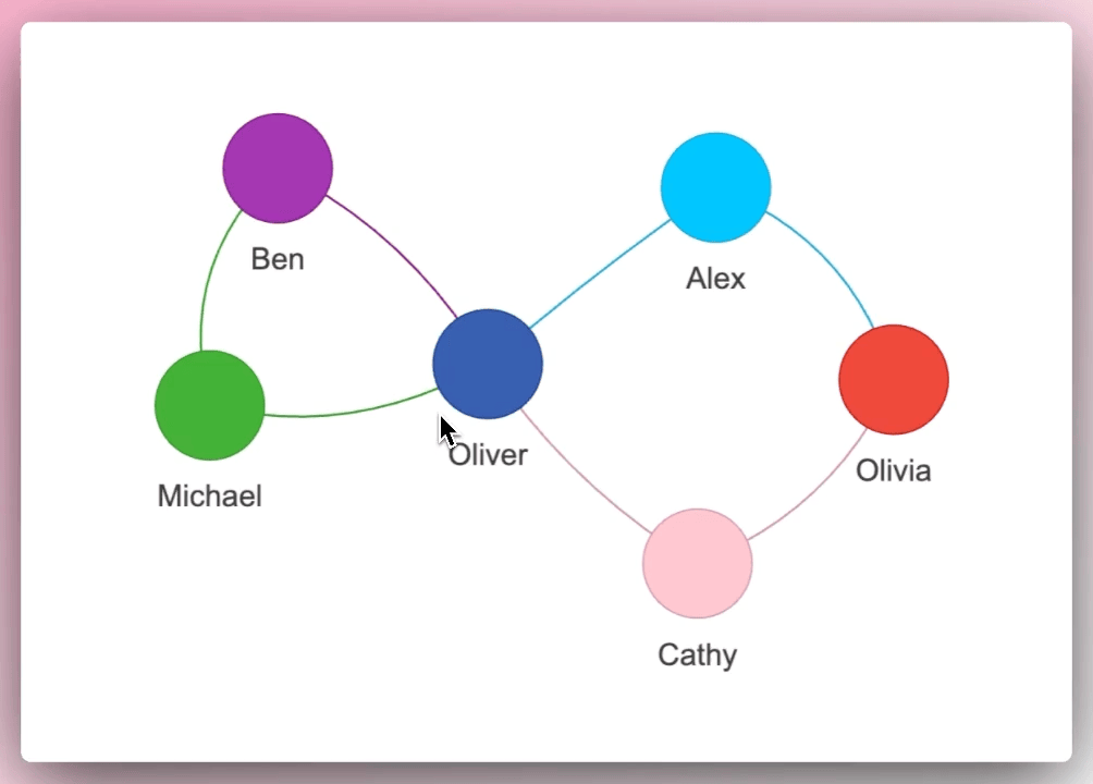
If you to create an interactive network graph in a few lines of Python code, use Pyvis.
Pyvis: Visualize Interactive Network Graphs in Python Read More »

When fine-tuning the hyperparameters of your machine learning model, it can be challenging to comprehend the connections between various combinations of hyperparameters and a particular metric.
With HiPlot, you can create parallel plots to understand the relationships within your data in a few lines of Python code.
Play with the plot above here.
Link to HiPlot.
Visualize Hyperparameter Connections with HiPlot Read More »
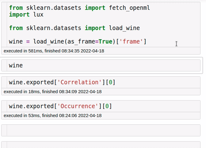
Have you ever taken a while to come up with the visualizations for your data? With Lux, you can get some suggestions on what to visualize.
To use Lux, simply import it.
Lux: A Python API for Intelligent Visual Discovery Read More »

If you want to find an easy way to visualize and interpret a decision tree model, use dtreeviz.
The image above shows the output of dtreeviz when applying it to DecisionTreeClassifier.
dtreeviz: Visualize and Interpret a Decision Tree Model Read More »

To find the hyperparameter where the estimator is neither underfitting nor overfitting, use Yellowbrick’s validation curve.
As we can see from the plot above, although max_depth > 2 has a higher training score but a lower cross-validation score. This indicates that the model is overfitting.
Thus, the sweet spot will be where the cross-validation score neither increases nor decreases, which is 2.
Validation Curve: Determine if an Estimator Is Underfitting Over Overfitting Read More »

If you want to automatically adjust annotations in a matplotlib plot for readability, use the library adjustText.
Automatically Adjust Annotations in Matplotlib for Readability Read More »

If you want to create an interactive presentation using Python in your Jupyter Notebook, try ipyvizzu-story.
ipyvizzu-story: Create an Interactive Presentation in Your Jupyter Notebook Read More »

If you want to explain the output of your machine learning model, use SHAP. In the code above, I use SHAP’s summary plot to visualize the overall impact of features in a DataFrame.
SHAP: Explain Any Machine Learning Model in Python Read More »