Newsletter #229: latexify: Turn Python Functions Into Clean Math Formulas
📅 Today’s Picks
Build Faster Tests with pytest Session Fixtures
Problem
pytest fixtures provide reusable test data, but they reload for every test function by default.
When your fixture loads a large DataFrame, every test reloads the same data, wasting time and delaying your development workflow.
Solution
Session-scoped fixtures load data once at the start and reuse it across all test functions.
Apply this pattern to:
Load large datasets once instead of reloading for each test function
Share a database connection across all tests without passing it as a parameter
Automatically set random seeds for reproducible train/test splits
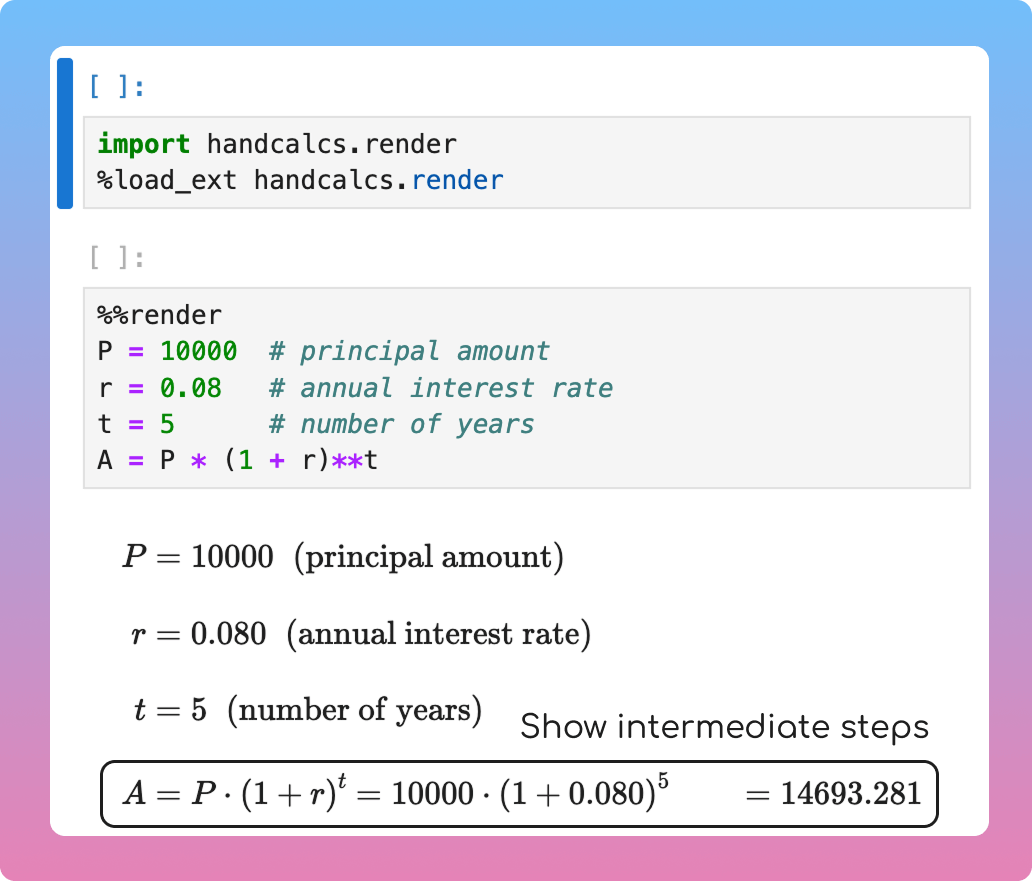
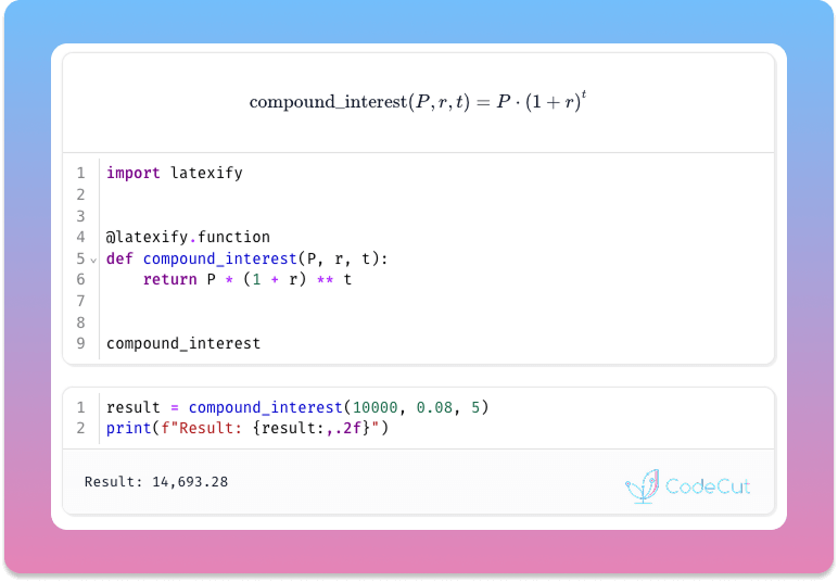
latexify: Turn Python Functions Into Clean Math Formulas
Problem
It is not ideal to present mathematical formulas written in Python code to executives and stakeholders as they are often not familiar with Python code.
However, writing LaTeX manually to show the formulas is time-consuming and tedious.
Solution
latexify transforms Python functions into clean mathematical notation with a single decorator. No manual LaTeX required.
Key features:
Automatic LaTeX generation from Python functions
Functions remain executable for calculations
Compatible with various notebooks such as Jupyter, Colab, and Marimo
☕️ Weekly Finds
ty
[Python Utils]
– An extremely fast Python type checker and language server, written in Rust
giotto-tda
[ML]
– A high-performance topological machine learning toolbox in Python built on top of scikit-learn
vibekit
[MLOps]
– Run Claude Code, Gemini, Codex — or any coding agent — in a clean, isolated sandbox with sensitive data redaction and observability baked in
Looking for a specific tool? Explore 70+ Python tools →
Stay Current with CodeCut
Actionable Python tips, curated for busy data pros. Skim in under 2 minutes, three times a week.
.codecut-subscribe-form .codecut-input {
background: #2F2D2E !important;
border: 1px solid #72BEFA !important;
color: #FFFFFF !important;
}
.codecut-subscribe-form .codecut-input::placeholder {
color: #999999 !important;
}
.codecut-subscribe-form .codecut-subscribe-btn {
background: #72BEFA !important;
color: #2F2D2E !important;
}
.codecut-subscribe-form .codecut-subscribe-btn:hover {
background: #5aa8e8 !important;
}
.codecut-subscribe-form {
max-width: 650px;
display: flex;
flex-direction: column;
gap: 8px;
}
.codecut-input {
-webkit-appearance: none;
-moz-appearance: none;
appearance: none;
background: #FFFFFF;
border-radius: 8px !important;
padding: 8px 12px;
font-family: ‘Comfortaa’, sans-serif !important;
font-size: 14px !important;
color: #333333;
border: none !important;
outline: none;
width: 100%;
box-sizing: border-box;
}
input[type=”email”].codecut-input {
border-radius: 8px !important;
}
.codecut-input::placeholder {
color: #666666;
}
.codecut-email-row {
display: flex;
align-items: stretch;
height: 36px;
gap: 8px;
}
.codecut-email-row .codecut-input {
flex: 1;
}
.codecut-subscribe-btn {
background: #72BEFA;
color: #2F2D2E;
border: none;
border-radius: 8px;
padding: 8px 14px;
font-family: ‘Comfortaa’, sans-serif;
font-size: 14px;
font-weight: 500;
cursor: pointer;
text-decoration: none;
display: flex;
align-items: center;
justify-content: center;
transition: background 0.3s ease;
}
.codecut-subscribe-btn:hover {
background: #5aa8e8;
}
.codecut-subscribe-btn:disabled {
background: #999;
cursor: not-allowed;
}
.codecut-message {
font-family: ‘Comfortaa’, sans-serif;
font-size: 12px;
padding: 8px;
border-radius: 6px;
display: none;
}
.codecut-message.success {
background: #d4edda;
color: #155724;
display: block;
}
@media (max-width: 480px) {
.codecut-email-row {
flex-direction: column;
height: auto;
gap: 8px;
}
.codecut-input {
border-radius: 8px;
height: 36px;
}
.codecut-subscribe-btn {
width: 100%;
text-align: center;
border-radius: 8px;
height: 36px;
}
}
Subscribe
Newsletter #229: latexify: Turn Python Functions Into Clean Math Formulas Read More »