Generic selectors
Exact matches only
Search in title
Search in content
Post Type Selectors
Filter by Categories
About Article
Analyze Data
Archive
Best Practices
Better Outputs
Blog
Code Optimization
Code Quality
Command Line
Daily tips
Dashboard
Data Analysis & Manipulation
Data Engineer
Data Visualization
DataFrame
Delta Lake
DevOps
DuckDB
Environment Management
Feature Engineer
Git
Jupyter Notebook
LLM
LLM Tools
Machine Learning
Machine Learning & AI
Machine Learning Tools
Manage Data
MLOps
Natural Language Processing
Newsletter Archive
NumPy
Pandas
Polars
PySpark
Python Helpers
Python Tips
Python Utilities
Scrape Data
SQL
Testing
Time Series
Tools
Visualization
Visualization & Reporting
Workflow & Automation
Workflow Automation

Visualization

Drag-and-Drop Visualizations with PyGWalker

EDA is a crucial step in any Data Science project. For large datasets, EDA can be time-consuming.

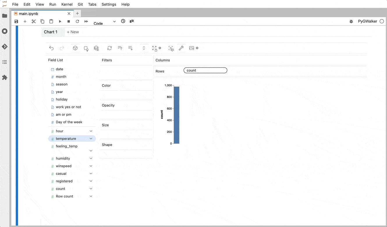
PyGWalker simplifies the process of creating visualizations by allowing users to drag and drop variables to create charts without writing much code.

You can use PyGWalker without changing your existing workflow. For example, you can call up PyGWalker with the Dataframe loaded in this way:

import pygwalker as pyg
import pandas as pd

df = pd.read_csv("https://kanaries-app.s3.ap-northeast-1.amazonaws.com/public-datasets/bike_sharing_dc.csv", parse_dates=['date'])
df.head(10)

Output:

date month season hour year holiday temperature feeling_temp \
0 2011-01-01 1 winter 0 2011 no 3.28 3.0014
1 2011-01-01 1 winter 1 2011 no 2.34 1.9982
2 2011-01-01 1 winter 2 2011 no 2.34 1.9982
3 2011-01-01 1 winter 3 2011 no 3.28 3.0014
4 2011-01-01 1 winter 4 2011 no 3.28 3.0014

humidity winspeed casual registered count work yes or not am or pm \
0 81.0 0.0 3 13 16 0 am
1 80.0 0.0 8 32 40 0 am
2 80.0 0.0 5 27 32 0 am
3 75.0 0.0 3 10 13 0 am
4 75.0 0.0 0 1 1 0 am

Day of the week
0 6
1 6
2 6
3 6
4 6

And then just walk around!

Link to PygWalker.

Run in Google Colab.
Favorite

Drag-and-Drop Visualizations with PyGWalker Read More »

Phoenix: Visualize High-Dimensional Data to Identify Performance Issues

During system performance degradation, pinpointing underlying causes can be challenging, especially with datasets containing numerous features.

Phoenix leverages UMAP to visualize high-dimensional data during periods of performance degradation, thereby enabling the identification of clusters of problematic data.

Link to Phoenix.
Favorite

Phoenix: Visualize High-Dimensional Data to Identify Performance Issues Read More »

Uniplot: Terminal-Based Plotting for Enhanced Data Science Pipelines

Uniplot, a lightweight library, generates plots directly in the terminal. Its independence from the Jupyter Notebook allows for versatile use, such as seamlessly integrating plotting capabilities into your data science CI/CD pipeline.

As a result, when a problem occurs, you not only obtain the backtrace but also visual plots that aid in identifying the problem.

Link to uniplot.
Favorite

Uniplot: Terminal-Based Plotting for Enhanced Data Science Pipelines Read More »

0
    0
    Your Cart
    Your cart is empty
    Scroll to Top

    Work with Khuyen Tran

    Work with Khuyen Tran