squarify: Plot Treemap in Python
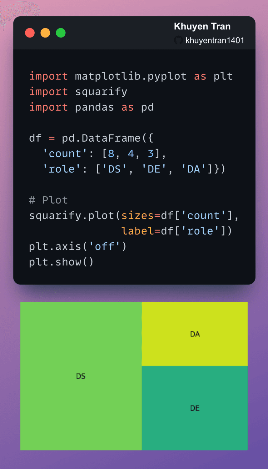
A treemap splits a rectangle into sub-rectangles, whose sizes are proportional to their values. To plot a treemap in Python, use squarify.
A treemap splits a rectangle into sub-rectangles, whose sizes are proportional to their values. To plot a treemap in Python, use squarify.

Have you ever wanted to create a flow chart using simple code logic? That is when Mermaid comes in handy.
The code to create the diagram above:
graph TD
A[Should you go to work today?] –> B(Do you like working?)
B –Yes–> C{Go to work}
B –No–> D(Are you feeling sick?)
D –Yes–> E{Go to the doctor}
D –No–> F(Do you have a lot of work to do?)
F –Yes–> H(And you don't want to go?)
F –No–> H
H –Yes, I don't want to–>I(You signed up for this. Get dressed and go to work!)
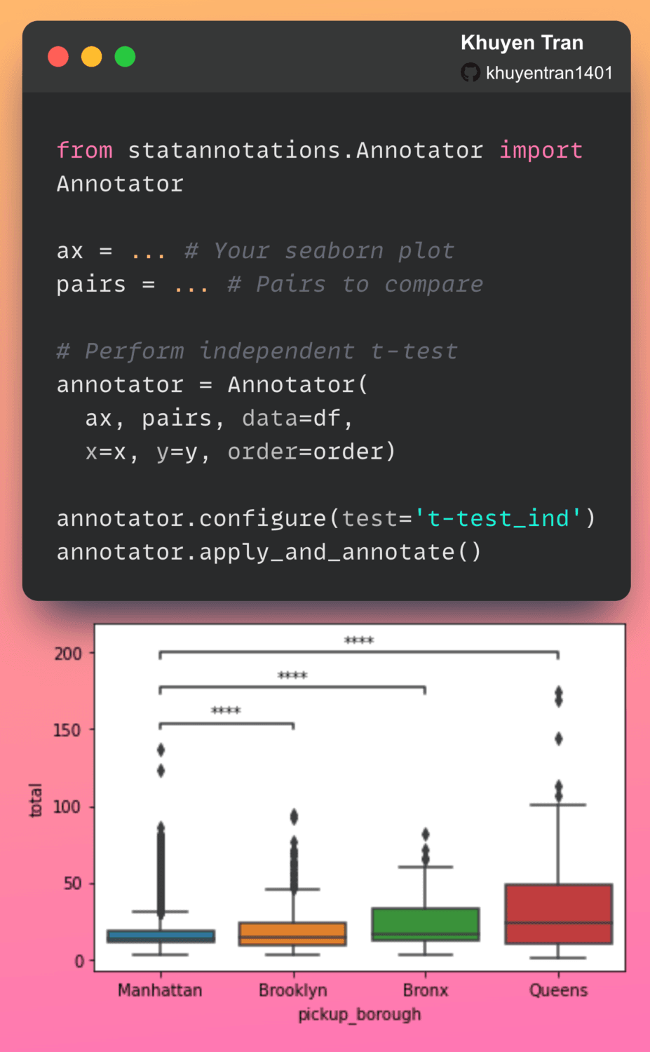
Have you ever looked at two box plots and wondered if there is a significant difference between the means of the two groups? statannotations makes it easy for you to add statistical significance annotations on seaborn plots.
In the code above, we use an independent t-test to compare the means of two independent groups.
From the plot, we can see that there is statistical evidence that the mean taxi fare in Manhattan is significantly different from the mean taxi fare in Brooklyn or Bronx, or Queens.
Add Statistical Significance Annotations on Seaborn Plots Read More »
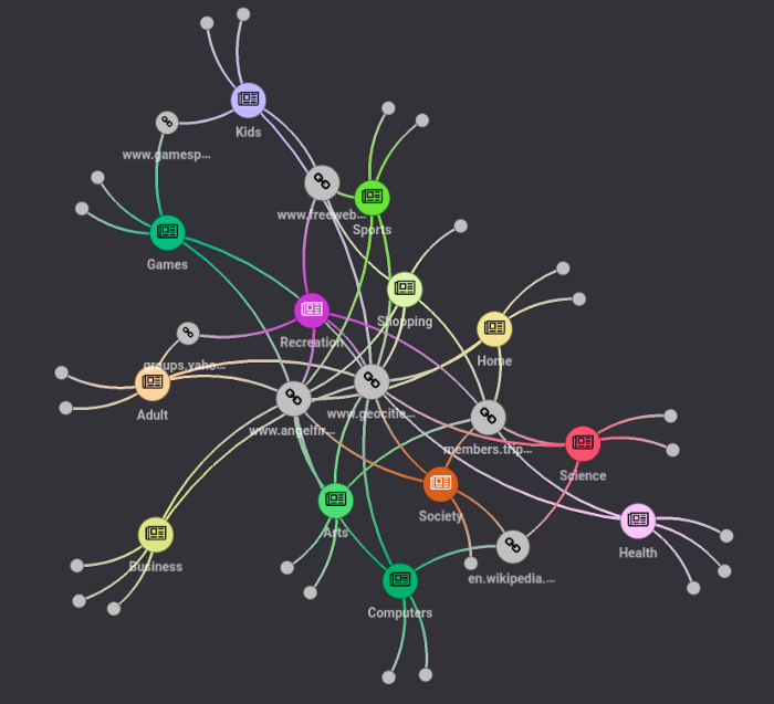
Have you ever tried to extract features and insights from URLs, but found it difficult to do so? Wouldn’t it be nice if you can extract features and create a nice network graph for your URLs as shown in the graph above?
In my latest article, you will learn how to use the combination of yarl and PyGraphistry to do exactly that.

Visualizing text data in 2D typically requires several steps: cleaning, encoding, and dimensionality reduction. These processes can be time-consuming.
texthero library simplifies this task, allowing you to perform all these steps efficiently.
The following example demonstrates how to use texthero to visualize CNN news article descriptions from a Kaggle dataset. Each point in the resulting plot represents an article, color-coded by its category.
import pandas as pd
import texthero as hero
import matplotlib.pyplot as plt
# Load the data
df = pd.read_csv("small_CNN.csv")
# Process and reduce dimensionality of the text data
df["pca"] = (df["Description"]
.pipe(hero.clean)
.pipe(hero.tfidf)
.pipe(hero.pca))
# Create the visualization
plt.figure(figsize=(10, 3))
hero.scatterplot(df, col="pca", color="Category", title="CNN News")
plt.show()
This code efficiently cleans the text, applies TF-IDF encoding, performs PCA, and creates a 2D scatter plot of the articles, all in just a few lines of code.
texthero: Reduce Dimension and Visualize Text in One Line of Code Read More »

If you want to learn machine learning through interactive visualization, check out A visual introduction to machine learning
The visualization is stunning, and the explanation is intuitive.
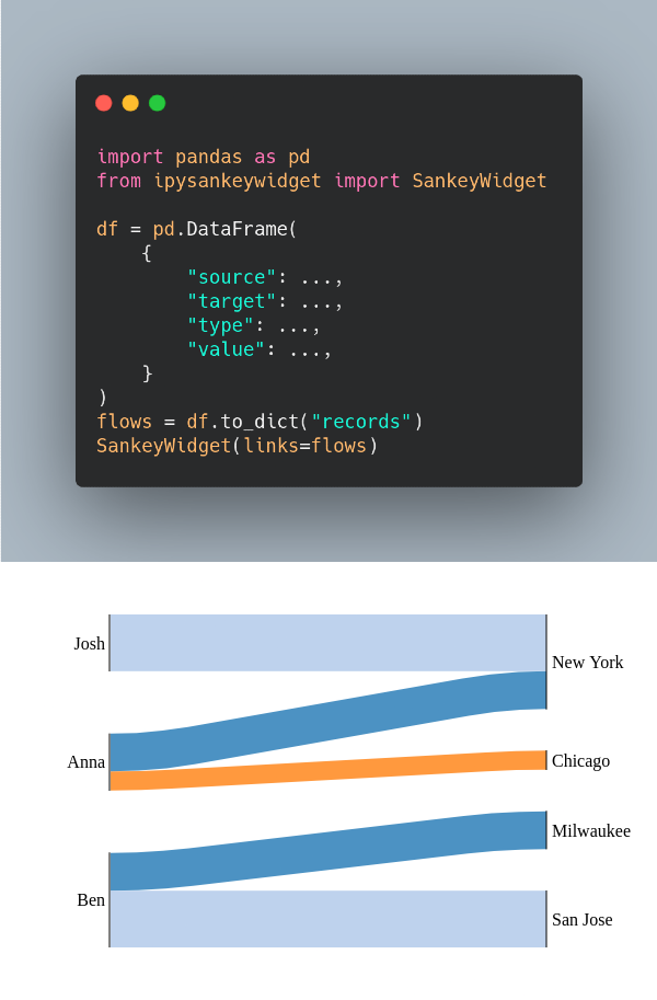
Sankey diagram is a flow diagram that depicts flows, where the width of the lines is proportional to the flow rate.
If you want to quickly create a Sankey diagram in your Jupyter Notebook, use ipysankeywidget.

The more features a model has, the more sensitive the model is to errors due to variance. Thus, we want to select the minimum required features to produce a valid model.
A common approach to eliminate features is to eliminate the ones that are the least important to the model. Then we re-evaluate if the model actually performs better during cross-validation.
Yellowbrick’s FeatureImportances is ideal for this task since it helps us to visualize the relative importance of the features for the model.

Seaborn style looks nicer than the default style of matplotlib, but matplotlib is more customizable.
If you want to apply seaborn style on matplotlib plots, use seaborn.set_theme().
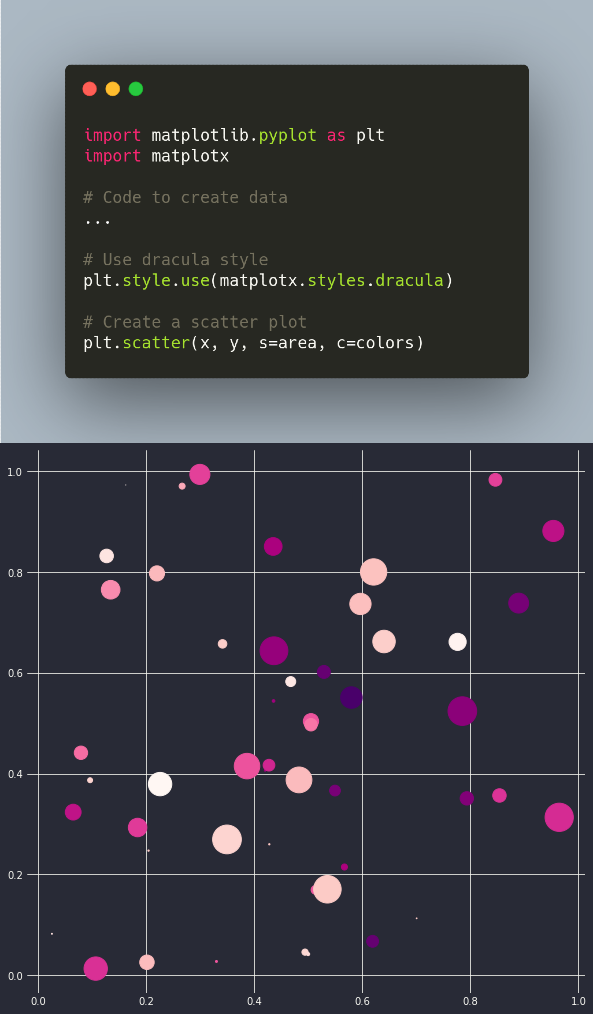
Have you ever wanted to create matplotlib plot in dark mode? If so, use matplotx.
For example, to use Dracula style, add plt.style.use(matplotx.styles.dracula) to the code.
Google Colab notebook of the code above.
Find other styles that matplotx supports here.