The Hidden Cost of Python Dictionaries (And 3 Safer Alternatives)
Table of Contents
Introduction
What Are Typed Data Containers?
Using Dictionaries
Using NamedTuple
Using dataclass
Using Pydantic
Final Thoughts
Related Tutorials
Introduction
Imagine you’re processing customer records. The pipeline runs without errors, but customers never receive their welcome emails. After digging through the code, you discover the issue is a simple typo in a dictionary key.
def load_customer(row):
return {"customer_id": row[0], "name": row[1], "emial": row[2]} # Typo
def send_welcome_email(customer):
email = customer.get("email") # Returns None silently
if email:
print(f"Sending email to {email}")
# No email sent, no error raised
customer = load_customer(["C001", "Alice", "alice@example.com"])
send_welcome_email(customer) # Nothing happens
Since .get() returns None for a missing key, the bug stays hidden.
This is exactly the type of issue we want to catch earlier. In this article, we’ll look at how typed data containers like NamedTuple, dataclass, and Pydantic help surface these bugs at runtime.
Interactive Course: Master Python data containers with hands-on exercises in our interactive Python data containers course.
What Are Typed Data Containers?
Python offers several ways to structure data, each adding more safety than the last:
dict: No protection. Bugs surface only when you access a missing key.
NamedTuple: Basic safety. Catches typos at write time in your IDE and at runtime.
dataclass: Static analysis support. Tools like mypy catch errors before your code runs.
Pydantic: Full protection. Validates data the moment you create an instance.
Let’s see how each tool handles the same customer data:
Using Dictionaries
Dictionaries are quick to create but provide no safety:
customer = {
"customer_id": "C001",
"name": "Alice Smith",
"email": "alice@example.com",
"age": 28,
"is_premium": True,
}
print(customer["name"])
Alice Smith
Typo Bugs
A typo in the key name causes a KeyError at runtime:
customer["emial"] # Typo: should be "email"
KeyError: 'emial'
The error tells you what went wrong but not where. When dictionaries pass through multiple functions, finding the source of a typo can take significant debugging time:
def load_customer(row):
return {"customer_id": row[0], "name": row[1], "emial": row[2]} # Typo here
def validate_customer(customer):
return customer # Passes through unchanged
def send_email(customer):
return customer["email"] # KeyError raised here
customer = load_customer(["C001", "Alice", "alice@example.com"])
validated = validate_customer(customer)
send_email(validated) # Error points here, but bug is in load_customer
KeyError Traceback (most recent call last)
13 customer = load_customer(["C001", "Alice", "alice@example.com"])
14 validated = validate_customer(customer)
—> 15 send_email(validated) # Error points here, but bug is in load_customer
Cell In[6], line 10, in send_email(customer)
9 def send_email(customer):
—> 10 return customer["email"]
KeyError: 'email'
The stack trace shows where the KeyError was raised, not where "emial" was written. The bug and its symptom are 13 lines apart here, but in production code, they could be in different files entirely.
Using .get() makes it worse by returning None silently:
email = customer.get("email") # Returns None – key is "emial" not "email"
print(f"Sending email to: {email}")
Sending email to: None
This silent failure is dangerous: your notification system might skip thousands of customers, or worse, your code could write None to a database column, corrupting your data pipeline.
Type Confusion
Typos cause crashes, but wrong types can corrupt your data silently. Since dictionaries have no schema, nothing stops you from assigning the wrong type to a field:
customer = {
"customer_id": "C001",
"name": 123, # Should be a string
"age": "twenty-eight", # Should be an integer
}
total_age = customer["age"] + 5
TypeError: can only concatenate str (not "int") to str
The error message is misleading: it says “concatenate str” but the real problem is that age should never have been a string in the first place.
Using NamedTuple
NamedTuple is a lightweight way to define a fixed structure with named fields and type hints, like a dictionary with a schema:
from typing import NamedTuple
class Customer(NamedTuple):
customer_id: str
name: str
email: str
age: int
is_premium: bool
customer = Customer(
customer_id="C001",
name="Alice Smith",
email="alice@example.com",
age=28,
is_premium=True,
)
print(customer.name)
Alice Smith
IDE Autocomplete Catches Typos
Your IDE can’t autocomplete dictionary keys, so typing customer[" shows no suggestions. With NamedTuple, typing customer. displays all available fields: customer_id, name, email, age, is_premium.
Even if you skip autocomplete and type manually, typos are flagged instantly with squiggly lines:
customer.emial
~~~~~
Running the code will raise an error:
customer.emial
AttributeError: 'Customer' object has no attribute 'emial'
The error names the exact object and missing attribute, so you know immediately what to fix.
Immutability Prevents Accidental Changes
NamedTuples are immutable, meaning once created, their values cannot be changed:
customer.name = "Bob" # Raises an error
AttributeError: can't set attribute
This prevents bugs where data is accidentally modified during processing.
Limitations: No Runtime Type Validation
Type hints in NamedTuple are not enforced at runtime, so you can still pass in wrong types:
# Wrong types are accepted without error
customer = Customer(
customer_id="C001",
name=123, # Should be str, but int is accepted
email="alice@example.com",
age="twenty-eight", # Should be int, but str is accepted
is_premium=True,
)
print(f"Name: {customer.name}, Age: {customer.age}")
Name: 123, Age: twenty-eight
The code runs, but with incorrect data types. The bug surfaces later when you try to use the data.
Using dataclass
dataclass reduces the boilerplate of writing classes that mainly hold data. Instead of manually writing __init__ and other methods, you just declare your fields.
It provides the same IDE support as NamedTuple, plus three additional features:
Mutable objects: You can change field values after creation
Mutable defaults: Safe defaults for lists and dicts with field(default_factory=list)
Post-init logic: Run custom validation or compute derived fields with __post_init__
from dataclasses import dataclass
@dataclass
class Customer:
customer_id: str
name: str
email: str
age: int
is_premium: bool = False # Default value
customer = Customer(
customer_id="C001",
name="Alice Smith",
email="alice@example.com",
age=28,
)
print(f"{customer.name}, Premium: {customer.is_premium}")
Alice Smith, Premium: False
Mutability Allows Updates
Dataclass trades NamedTuple’s immutability protection for flexibility. You can modify fields after creation:
customer.name = "Alice Johnson" # Changed after marriage
customer.is_premium = True # Upgraded their account
print(f"{customer.name}, Premium: {customer.is_premium}")
Alice Johnson, Premium: True
For extra safety, use @dataclass(slots=True) to prevent accidentally adding new attributes:
@dataclass(slots=True)
class Customer:
customer_id: str
name: str
email: str
age: int
is_premium: bool = False
customer = Customer(
customer_id="C001",
name="Alice",
email="alice@example.com",
age=28,
)
customer.nmae = "Bob" # Typo
AttributeError: 'Customer' object has no attribute 'nmae'
Mutable Defaults with default_factory
Mutable defaults like lists don’t work as expected. You might think each instance gets its own empty list, but Python creates the default [] once and all instances share it:
from typing import NamedTuple
class Order(NamedTuple):
order_id: str
items: list = []
order1 = Order("001")
order2 = Order("002")
order1.items.append("apple")
print(f"Order 1: {order1.items}")
print(f"Order 2: {order2.items}") # Also has "apple"!
Order 1: ['apple']
Order 2: ['apple']
Order 2 has “apple” even though we only added it to Order 1. Modifying one order’s items affects every order.
Dataclass prevents this mistake by rejecting mutable defaults:
@dataclass
class Order:
items: list = []
ValueError: mutable default <class 'list'> for field items is not allowed: use default_factory
Dataclass offers field(default_factory=…) as the solution. The factory function runs at instance creation, not class definition, so each object gets its own list:
from dataclasses import dataclass, field
@dataclass
class Order:
order_id: str
items: list = field(default_factory=list) # Each instance gets its own list
order1 = Order("001")
order2 = Order("002")
order1.items.append("apple")
print(f"Order 1: {order1.items}")
print(f"Order 2: {order2.items}") # Not affected by order1
Order 1: ['apple']
Order 2: []
Unlike the NamedTuple example, Order 2 stays empty because it has its own list.
Post-Init Validation with __post_init__
Without validation, invalid data passes through silently:
@dataclass
class Customer:
customer_id: str
name: str
email: str
age: int
is_premium: bool = False
customer = Customer(
customer_id="C001",
name="", # Empty name
email="invalid",
age=-100,
)
print(f"Created: {customer}") # No error – bad data is in your system
Created: Customer(customer_id='C001', name='', email='invalid', age=-100, is_premium=False)
Dataclass provides __post_init__ to catch these issues at creation time so you can validate fields before the object is used:
@dataclass
class Customer:
customer_id: str
name: str
email: str
age: int
is_premium: bool = False
def __post_init__(self):
if self.age < 0:
raise ValueError(f"Age cannot be negative: {self.age}")
if "@" not in self.email:
raise ValueError(f"Invalid email: {self.email}")
customer = Customer(
customer_id="C001",
name="Alice",
email="invalid-email",
age=28,
)
ValueError: Invalid email: invalid-email
The error message tells you exactly what’s wrong, making the bug easy to fix.
Limitations: Manual Validation Only
__post_init__ requires you to write every validation rule yourself. If you forget to check a field, bad data can still slip through.
In this example, __post_init__ only validates email format, so wrong types for name and age pass undetected:
@dataclass
class Customer:
customer_id: str
name: str
email: str
age: int
is_premium: bool = False
def __post_init__(self):
if "@" not in self.email:
raise ValueError(f"Invalid email: {self.email}")
customer = Customer(
customer_id="C001",
name=123, # No validation for name type
email="alice@example.com",
age="twenty-eight", # No validation for age type
)
print(f"Name: {customer.name}, Age: {customer.age}")
Name: 123, Age: twenty-eight
Type hints alone don’t enforce types at runtime. For automatic validation, you need a library that actually checks types when objects are created.
📚 For comprehensive coverage of dataclasses and Pydantic in production workflows, check out Production-Ready Data Science.
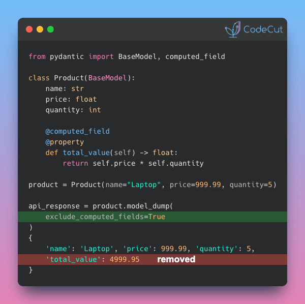
Using Pydantic
Pydantic is a data validation library that enforces type hints at runtime. Unlike NamedTuple and dataclass, it actually checks that values match their declared types when objects are created. Install it with:
pip install pydantic
To create a Pydantic model, inherit from BaseModel and declare your fields with type hints:
from pydantic import BaseModel
class Customer(BaseModel):
customer_id: str
name: str
email: str
age: int
is_premium: bool = False
customer = Customer(
customer_id="C001",
name="Alice Smith",
email="alice@example.com",
age=28,
)
print(f"{customer.name}, Age: {customer.age}")
Alice Smith, Age: 28
For using Pydantic to enforce structured outputs from AI models, see our PydanticAI tutorial.
Runtime Validation
Remember how dataclass accepted name=123 without complaint? Pydantic catches this automatically with a ValidationError:
from pydantic import BaseModel, ValidationError
class Customer(BaseModel):
customer_id: str
name: str
email: str
age: int
is_premium: bool = False
try:
customer = Customer(
customer_id="C001",
name=123,
email="alice@example.com",
age="thirty",
)
except ValidationError as e:
print(e)
2 validation errors for Customer
name
Input should be a valid string [type=string_type, input_value=123, input_type=int]
age
Input should be a valid integer, unable to parse string as an integer [type=int_parsing, input_value='thirty', input_type=str]
The error message shows:
Which fields failed validation (name, age)
What was expected (valid string, valid integer)
What was received (123 as int, 'thirty' as str)
This tells you everything you need to fix the bug in one place, instead of digging through stack traces.
Type Coercion
Unlike dataclass which stores whatever you pass, Pydantic automatically converts compatible types to match your type hints:
customer = Customer(
customer_id="C001",
name="Alice Smith",
email="alice@example.com",
age="28", # String "28" is converted to int 28
is_premium="true", # String "true" is converted to bool True
)
print(f"Age: {customer.age} (type: {type(customer.age).__name__})")
print(f"Premium: {customer.is_premium} (type: {type(customer.is_premium).__name__})")
Age: 28 (type: int)
Premium: True (type: bool)
This is useful when reading data from CSV files or APIs where everything comes as strings.
Constraint Validation
Beyond types, you often need business rules: age must be positive, names can’t be empty, customer IDs must follow a pattern.
In dataclass, you define fields in one place and validate them in __post_init__. The validation logic grows with each constraint:
@dataclass
class Customer:
customer_id: str
name: str
email: str
age: int
is_premium: bool = False
def __post_init__(self):
if not self.customer_id:
raise ValueError("Customer ID cannot be empty")
if not self.name or len(self.name) < 1:
raise ValueError("Name cannot be empty")
if "@" not in self.email:
raise ValueError(f"Invalid email: {self.email}")
if self.age < 0 or self.age > 150:
raise ValueError(f"Age must be between 0 and 150: {self.age}")
Pydantic puts constraints directly in Field(), keeping rules next to the data they validate:
from pydantic import BaseModel, Field, ValidationError
class Customer(BaseModel):
customer_id: str
name: str = Field(min_length=1)
email: str
age: int = Field(ge=0, le=150) # Age must be between 0 and 150
is_premium: bool = False
try:
customer = Customer(
customer_id="C001",
name="", # Empty name
email="alice@example.com",
age=-5, # Negative age
)
except ValidationError as e:
print(e)
2 validation errors for Customer
name
String should have at least 1 character [type=string_too_short, input_value='', input_type=str]
age
Input should be greater than or equal to 0 [type=greater_than_equal, input_value=-5, input_type=int]
Nested Validation
Data structures are rarely flat. A customer has an address, an order contains items. When something is wrong inside a nested object, you need to know exactly where.
Pydantic validates each level and reports the full path to any error:
from pydantic import BaseModel, Field, ValidationError
class Address(BaseModel):
street: str
city: str
zip_code: str = Field(pattern=r"^\d{5}$") # Must be 5 digits
class Customer(BaseModel):
customer_id: str
name: str
address: Address
try:
customer = Customer(
customer_id="C001",
name="Alice Smith",
address={
"street": "123 Main St",
"city": "New York",
"zip_code": "invalid", # Invalid zip code
},
)
except ValidationError as e:
print(e)
1 validation error for Customer
address.zip_code
String should match pattern '^\d{5}$' [type=string_pattern_mismatch, input_value='invalid', input_type=str]
The error message shows address.zip_code, pinpointing the exact location in the nested structure.
For extracting structured data from documents using Pydantic, see our LlamaIndex data extraction guide.
Final Thoughts
To summarize what each tool provides:
dict: Quick to create. No structure or validation.
NamedTuple: Fixed structure with IDE autocomplete. Immutable.
dataclass: Mutable fields, safe defaults, custom logic via __post_init__.
Pydantic: Runtime type enforcement, automatic type coercion, built-in constraints.
Personally, I use dict for quick prototyping:
stats = {"rmse": 0.234, "mae": 0.189, "r2": 0.91}
Then Pydantic when the code moves to production. For example, a training config should reject invalid values like negative learning rates:
from pydantic import BaseModel, Field
class TrainingConfig(BaseModel):
epochs: int = Field(ge=1)
batch_size: int = Field(ge=1)
learning_rate: float = Field(gt=0)
config = TrainingConfig(epochs=10, batch_size=32, learning_rate=0.001)
Pick the level of protection that matches your needs. A notebook experiment doesn’t need Pydantic, but a production API does.
Related Tutorials
SQLModel vs psycopg2: Combine Pydantic-style validation with database integration
Pytest for Data Scientists: Test your data containers and processing pipelines
Hydra for Python Configuration: Manage validated configuration with YAML-based pipelines
📚 Want to go deeper? Learning new techniques is the easy part. Knowing how to structure, test, and deploy them is what separates side projects from real work. My book shows you how to build data science projects that actually make it to production. Get the book →
💻 Get the Code: The complete source code and Jupyter notebook for this tutorial are available on GitHub. Clone it to follow along!
Stay Current with CodeCut
Actionable Python tips, curated for busy data pros. Skim in under 2 minutes, three times a week.
.codecut-subscribe-form .codecut-input {
background: #2F2D2E !important;
border: 1px solid #72BEFA !important;
color: #FFFFFF !important;
}
.codecut-subscribe-form .codecut-input::placeholder {
color: #999999 !important;
}
.codecut-subscribe-form .codecut-subscribe-btn {
background: #72BEFA !important;
color: #2F2D2E !important;
}
.codecut-subscribe-form .codecut-subscribe-btn:hover {
background: #5aa8e8 !important;
}
.codecut-subscribe-form {
max-width: 650px;
display: flex;
flex-direction: column;
gap: 8px;
}
.codecut-input {
-webkit-appearance: none;
-moz-appearance: none;
appearance: none;
background: #FFFFFF;
border-radius: 8px !important;
padding: 8px 12px;
font-family: ‘Comfortaa’, sans-serif !important;
font-size: 14px !important;
color: #333333;
border: none !important;
outline: none;
width: 100%;
box-sizing: border-box;
}
input[type=”email”].codecut-input {
border-radius: 8px !important;
}
.codecut-input::placeholder {
color: #666666;
}
.codecut-email-row {
display: flex;
align-items: stretch;
height: 36px;
gap: 8px;
}
.codecut-email-row .codecut-input {
flex: 1;
}
.codecut-subscribe-btn {
background: #72BEFA;
color: #2F2D2E;
border: none;
border-radius: 8px;
padding: 8px 14px;
font-family: ‘Comfortaa’, sans-serif;
font-size: 14px;
font-weight: 500;
cursor: pointer;
text-decoration: none;
display: flex;
align-items: center;
justify-content: center;
transition: background 0.3s ease;
}
.codecut-subscribe-btn:hover {
background: #5aa8e8;
}
.codecut-subscribe-btn:disabled {
background: #999;
cursor: not-allowed;
}
.codecut-message {
font-family: ‘Comfortaa’, sans-serif;
font-size: 12px;
padding: 8px;
border-radius: 6px;
display: none;
}
.codecut-message.success {
background: #d4edda;
color: #155724;
display: block;
}
/* Mobile responsive */
@media (max-width: 480px) {
.codecut-email-row {
flex-direction: column;
height: auto;
gap: 8px;
}
.codecut-input {
border-radius: 8px;
height: 36px;
}
.codecut-subscribe-btn {
width: 100%;
text-align: center;
border-radius: 8px;
height: 36px;
}
}
Subscribe
The Hidden Cost of Python Dictionaries (And 3 Safer Alternatives) Read More »